Stock Picks

Emerging Markets Could Be Leading Global Markets

Emerging markets, as a group, remain more than 20% below their recent peak. A decline of 20% is the commonly accepted definition of a bear market. And, now, by that measure emerging markets are in bear market mode.

To measure emerging markets as a group, traders can turn to the iShares MSCI Emerging Markets ETF (NYSE: EEM). The chart of EEM is shown below.

EEM weekly chart

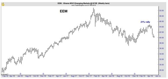
After a 21% rally earlier this year that sparked hopes of a new bull market, the down turn has resumed.

Before digging into what the drop means, it could be helpful to define the terms. An emerging market is a country that has some characteristics of a developed market but does not satisfy standards to be termed a developed market.

This includes countries that may become developed markets in the future or were in the past. The economies of China and India are considered to be the largest emerging markets.

Emerging markets fit between developed markets and “frontier markets,” a term used to describe developing countries with slower economies than those that are considered to be emerging. This can all be confusing, so economists have tried to refine the definition.

Some definitions require an emerging economy to display the following characteristics:

  • Intermediate income: its PPP per capita income is comprised between 10% and 75% of the average EU per capita income.
  • Catching-up growth: during at least the last decade, it has experienced a brisk economic growth that has narrowed the income gap with advanced economies.
  • Institutional transformations and economic opening: during the same period, it has undertaken profound institutional transformations which contributed to integrate it more deeply into the world economy. Hence, emerging economies appears to be a by-product of the current globalization.

But that definition, more than 50 countries, representing 60% of the world’s population and 45% of its GDP, are emerging. The ten largest Ems are, in alphabetical order, Argentina, Brazil, China, India, Indonesia, Mexico, Poland, South Africa, South Korea and Turkey.

Turmoil Is Spread Around the World

Often when emerging markets make a large price move, there is one region that stands out. That’s not the case right now. Problems in Turkey, Argentina and South Africa are ongoing and potentially serious.

iShares MSCI Turkey ETF (NYSE: TUR) is still more than 55% below its 2017 high.

TUR weekly chart

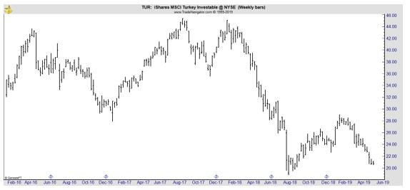
Turkey is in the midst of a little noticed financial crisis. As Al-Montor.com reports, “The two main actors in the economic crisis gripping Turkey are the central bank, which runs the state’s monetary policies, and the Treasury, which is in charge of fiscal policies.

The central bank is ostensibly independent, while the Treasury is attached to Treasury and Finance Minister Berat Albayrak, who is also President Recep Tayyip Erdogan’s son-in-law.

Those who follow how things work on the ground are well aware that the central bank does not act independently and is subject to direct and indirect government meddling. The bank has long felt compelled to seek Erdogan’s blessing in its interest rate decisions.

Recently, it has come under pressure to let the Treasury use its resources and — again, at Albayrak’s behest — do something it should never do, namely directly or indirectly intervene in the foreign exchange market.

The bank’s role in foreign currency sales by Treasury-controlled public banks, aimed at curbing the slump of the Turkish lira, is a case in point.

The central bank’s transfer of funds to the Treasury is even more intriguing. Such transfers are not something new — in fact, they are required by law, given that the bank is ultimately a state-owned company that transfers part of its profits to the Treasury.

 This year, however, the transfer that was due in April was brought forward to January via a legal amendment ahead of the March 31 local polls. As a result, the Treasury — saddled with major deficits due to the government’s preelection populism — was able to get early some 34 billion liras ($5.6 billion) instead of borrowing on high interest rates.

The Treasury has now reportedly set an eye on the central bank’s legal reserves, which represent 20% of its profits and a sum the bank sets aside by law to use in extraordinary circumstances.

There are legal obstructions to the move, but given the government’s record on respect for the law, many are convinced it would not be discouraged by legal hurdles. Its only reservation seems to be that such a blood transfusion would lay bare the Treasury’s desperate situation for all to see, including the foreign money markets.”

There is a more traditional crisis in Argentina. Global X FTSE Argentina 20 ETF (NYSE: ARGT) is about 25% below its 2017 highs.

ARGT weekly chart

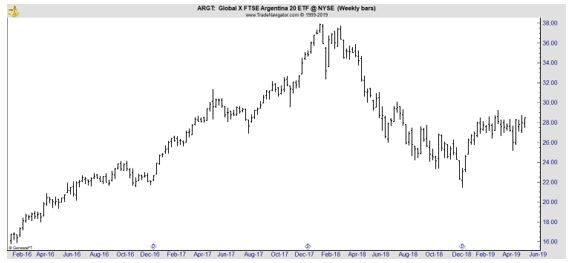
Here, the IMF is trying to bail out the country and the Financial Times notes, “When the IMF completed its third review of Argentina’s economy in early April, managing director Christine Lagarde boasted that the government policies linked to the country’s record $56bn bailout from the fund were “bearing fruit”. 

Less than a month later, amid darkening political prospects for incumbent president Mauricio Macri, the country’s currency crisis reignited and bond yields spiked, threatening not only the IMF’s Argentina programme but its reputation and that of its leader.”

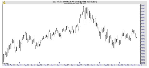
iShares MSCI South Africa Index ETF (NYSE: EZA) is almost 30% below its 2017 highs as populist policies in that country threaten economic growth.

EZA weekly chart

These three countries show that this crisis is different than other crises in the past. For example, in 2008, there was a common problem in emerging markets and developed economies as a credit crisis threatened the financial system.

That’s not the case this time and that indicates there could be different factors to consider when trading.

Safety Could Become Important

Traders are generally thinking about the possible returns on their capital. In other words, they are seeking opportunities to earn rewards of perhaps 10% a year on their investment accounts. In times of crisis, they often start to consider the importance of return of their capital.

When crises and bear markets hit, traders become increasingly concerned about losses of capital. They can react by putting their capital into investment opportunities that appear to be the safest. This explains why Treasury securities often rise in price when the stock market crashes.

In the current market environment, the crises are geographically diversified. Few stock markets around the world are in decisive bull markets with major stock market indexes at or near new all time highs. One market trading near new highs is the US stock market.

That means the US could offer safety to traders and markets in the country could benefit from a flight to safety trade. This could benefit large cap US stocks, the ones included in the S&P 500 index, for example, and US Treasury securities.

Treasuries could be beneficiaries of increased cash flow since they offer safety and the Federal Reserve is one of the few central banks in the world raising rates. That could make the market attractive to overseas investors.

In fact, that is what happened in the previous two emerging market bears. This is the third time EEM has fallen by at least 20% in the past ten years. Neither of the previous bears resulted in a bear market for US stocks.

In 2011, the S&P 500 Index fell 17.8% during the emerging market bear market. In hindsight, that was a buying opportunity for US investors.

The next emerging market bear developed in 2014. That time, the S&P 500 fell less than 7%. US stocks then rallied 12% before selling off by 12% as the emerging market continued for 16 months.

This time is probably the same as the other two times. US stocks could pull back but a bear market in the US won’t start until the US economy contracts. For now, there’s no sign of that.

Stock market strategies

Finding Winning Stocks With the Most Potential

Many investors study the past to find potential winners in the future. The idea is that stocks that did well in the past have attributes that can be used to spot potential winners in the future. This idea will not be foolproof, but it can be useful to consider the past.

A recent article at AAII.com prepared a study on this question. “The companies chosen for the study were based on companies in “The Greatest Stock Market Winners: 1970-1983,” published by William O’Neil & Co.

 To be considered a great winner, a company typically had to at least double in value within a calendar year, although there were a few exceptions to this guideline, and not all companies that doubled in value were selected.

On average, the 222 winners increased in value by 349%. While this average was buoyed by a few winners with astronomical increases, more than half the firms increased in value by at least 237%.

Historical fundamental and technical information on these firms was taken from the Datagraph books (also published by William O’Neil & Co. and sold primarily to institutional investors).

The results of this study are summarized in the table below.

stock market winners

Source: AAII.com

The first group of indicators, the smart money variables, do not seem to be useful in predicting major stock market moves.

Next, the study looked at five different valuation variables.

Among the 222 winners, 164 were selling for less than book value in the quarter in which the buy occurred.

The median price-to-book-value ratio was 0.60, while the average ratio was 0.95. (The median is the exact midpoint, where half of all ratios fall above and half fall below; it is used because it is less influenced by extreme values.)

While a price-to-book-value ratio of less than 1.00 may not be a perfect indicator of a stock market winner, it does seem to be a common characteristic. This suggests an investment strategy that isolates firms selling below book value.

Only one out of every 10 of these firms had price-earnings ratios of less than 5.0 in the buy quarter. This indicates that very low price-earnings ratios are not a necessary ingredient of a successful investment strategy.

The results also indicated that the winners are not characterized by either low stock prices or small stock market capitalizations (number of shares times price per share).

This suggests that small size, whether measured by share price or stock market capitalization, is not a necessary component of a successful investment strategy.

The betas of the stock market winners were examined to see if their extraordinary rates of return might be compensation for riskiness. While the firms as a group were slightly riskier than the market as a whole, the additional stock market risk cannot account for the extraordinary returns of these winners.

 The technical indicator measured among the stock winners was relative strength.

The relative strength of a stock is the average of quarterly price changes during the previous year, but giving more weight (40%) to the most recent quarter and less weight (20% each) to the three other quarters; these average changes are then ranked among all stocks, ranging from 1 (lowest) to 99 (highest).

Among the winners, the median rank in the buy quarter was 93; fully 212 of the 222 firms possessed relative strength rankings of greater than 70.

In addition, the relative strength rankings for 170 of the 222 winners increased between the quarter prior to the buy and the quarter during which the stock was purchased.

These findings show that investors should seek out firms with high relative strength rankings; and second, investors should try to identify firms that exhibit a positive change in their ranking from the prior quarter.

Several measures of earnings and profitability among the stock market winners were examined.

The average pretax profit margin in the buy quarter was 12.7%. In the quarter prior to the buy, the profit margin was slightly smaller, while by the sell quarter, the average profit margin had increased to 14.5%.

The nearly 2% increase in the pretax profit margins may have contributed to the significant price appreciation of these firms. Fully 216 of the 222 winners had positive pretax margins in the buy quarter and 215 had positive pretax margins in the quarter prior to the purchase.

This evidence clearly indicates that a high, positive pretax profit margin should be one of the selection screens in an investment strategy.

On average, quarterly earnings in the buy quarter rose nearly 45.9% from the previous quarter; these were not seasonally adjusted, and they represent changes in the raw accounting earnings.

Interestingly, quarterly earnings in the quarter prior to the buy increased an average of 60.8%, while in the quarter prior to that they increased an average of 50.4%—in other words, there was an acceleration in quarterly earnings.

Another investment rule suggested by the winners is to seek out firms with a positive change in quarterly earnings—earnings acceleration.

The pattern of changes in quarterly sales closely parallels that of changes in quarterly earnings. During the two quarters prior to the buy, quarterly sales were positive and increasing. During the buy quarter, quarterly sales on average increased 9.5%.

A longer term picture of earnings growth can also be useful. Investors should select companies that have positive five-year quarterly earnings growth rates.

Another useful screen is the number of common shares outstanding. Nearly 90% of the firms had fewer than 20 million shares of stock outstanding. Investors may want to select companies with fewer than 20 million outstanding shares of stock.

It’s also useful to look for stocks near new highs in price.

On the buy date, more than half the winners were selling within 8% of their previous two-year highs, and only one was selling at a price of less than half its previous two-year high. More than 80% of the firms were selling within 15% of their previous two-year highs.

An investment strategy that selects stocks selling within 15% of their two-year highs would capture a common characteristic of these winners.

These characteristics could help traders find the next big winners in the stock market.

Stock market

Reading a Cloud Chart

Ichimoku Cloud charts are a popular tool for analysts, perhaps because they are visually appealing.

AAPL chart

The most prominent feature on the chart is the shaded areas. These are the Clouds. There are actually five components of the chart and the construction of the Cloud Chart can be summarized as follows:

  1. Turning Line, which is the midpoint of the high and low of the last 9 sessions.
  2. Standard Line which is the midpoint of the high and low of the last 26 sessions.
  3. Cloud Span A is the midpoint of the turning line and the standard line and is shifted forward by 26 bars.
  4. Cloud Span B is the midpoint of the high and low of last 52 sessions and is also shifted 26 bars forward.
  5. The Lagging Line is the price line the (the closing price) shifted backwards by 26 bars.

Each of these components is also known by other names. The Turning Line is called the Tenkan-sen or the Conversion Line in some sources. The Standard Line is the Kijun-sen or Base Line. The Lagging Line is also known as the Chikou Span or the Lagging Span.

Now let’s look at how to analyze the chart of Apple (Nasdaq: AAPL) shown above. It can be confusing to look at the chart because there are several pieces of information. With experience, many traders like having a large amount of information available at a single glance.

With less experience, the chart can be overwhelming. To cut through potential confusion, we will look at that chart in three steps. In the first step, we will look only at the clouds and then we will address the interpretation of the various lines.

AAPL daily chart

Because the chart is less confusing, we have compressed the time to show more signals. With just the Clouds, interpretation is easy. When prices are above the Cloud, the chart is bullish. When prices are below the Cloud, the chart is bearish.

When prices are in the cloud, the answer is not clear but we should expect the previous trend to resume. Right now, prices entered the Cloud from above so we should expect AAPL to resume its uptrend.

The chart above shows these signals are clear enough that they can be traded. Sell when prices fall below the lower span of the loud and buy when prices break above the upper line of the Cloud. This is similar to a trading strategy using moving averages (MAs).

One problem with any MA is that signals come after the trend has reversed and you need to capture long-term trends to make up for the delays in the signals. Another problem with MAs is that there will inevitably be a number of whipsaw trades.

A whipsaw trade is one that lasts a short time before being reversed. These trades usually result in small gains or losses but trading costs can add up. These costs are generally overcome with an MA strategy because you will eventually be on the right side of a long-term trend.

Clouds should also deliver profits from long term trends but they will suffer from lags in signals and whipsaw trades while waiting for the big winners that are generally needed to make a trend following system successful.

This is an important point. Any individual trading decision based on Clouds can be wrong. There could be several losing signals in a row. It generally requires discipline to take 100% of the signals and a long-term commitment to profit from Clouds or any trend-following strategy.

In the chart above, we see that AAPL dropped below the lower line of the Cloud in the middle of November. This is bearish and it will take a break above the upper line of the Cloud for AAPL to turn bullish with this indicator.

The next chart removes the Cloud Spans and includes only the Turning Line and the Signal Line.

AAPL cloud chart

These lines are moving averages and should be interpreted in the same way any MA would be interpreted. When the faster moving average is above the shorter average, the chart is bullish. In this case, that would mean the Turning Line is above the Standard Line.

When the shorter MA is below the longer MA, the chart is bearish. In the chart above, the Standard Line, the longer moving average that uses 26-bars instead of 9 in its calculation, is shown in red. In the chart above, when the red line is on top, the chart is bearish.

From the chart above, you can see this system does a nice job providing buy and sell signals. Right now, AAPL is bearish on this reading.

Many traders will prefer a simpler approach than Clouds. A simple MA system, maybe buying when the 50-day MA crosses above the 200-day MA and selling on a downside cross, could be easier to trade. There would be only one signal to watch in that system.

With Clouds, traders have three signals to watch:

  1. Relationship of the closing price to the Cloud Spans; if the close is above the Clouds, the signal is bullish and when the close is below the Clouds the signal is bearish.
  2. The position of the Turning Line to the Standard Line.; when the Turning Line is above the Standard Line, the signal is bullish and when the Turning Line is below the Standard Line the signal is bearish.
  3. The position of the Lagging Line to the Cloud Spans; buy signals are given when the line is above the Cloud and a sell signal is given when the line is below the Cloud.

A trader could trade when all three signals agree or when two of the three agree or in some other way. You could also pick one of the three signals and base all decisions on that indicator, ignoring the other components of the Clouds.

Related post: Sex Drive Boosters for Men: Evidence-Based Approaches to Revitalize Libido

The important point, as it is with any indicator, to apply the same rules consistently. If you are consistent and disciplined, Clouds could deliver gains in the long run.

Stock market strategies

Investing Like a Rocket Scientist To Deliver Returns

Many investors are considering strategies that can be considered quantitative investing. This type of investing is, in general, a newer approach to investing that relies on tools that weren’t widely available to individual investors until recently.

In simplest terms, quant investors use computer screening to find investment ideas. They might use a database to screen for stocks with low price to earnings (P/E) ratios. Professional investors have had these tools for decades and many have put the tools to good use.

Consider James Simons, an investor who may not be as well know as Warren Buffett but who has a track record that might be even more impressive that Buffett’s.

After graduating from MIT, Simons worked as a cryptographer cracking codes for the Department of Defense during the Vietnam War. After that, he taught math at MIT and Harvard.

He worked with other researchers to develop a theorem for differential geometry that’s called the Chern-Simons forms. Experts say it is an important tool for theoretical physicists working to identify the smallest forces in the universe.

In 1982, Simons left academia and decided to apply his math skills to the financial markets. He founded Renaissance Technologies, a hedge fund group that uses complex math tools to take advantage of inefficiencies in futures, currencies, and the stock market.

His firm now employs more than 300 professionals, many with PhDs in math and science. His benchmark fund, the Medallion Fund delivered annual returns of 35.6% at a time when the S&P 500 gained an average of 9.2% a year over twenty years.

That return is after fees and Renaissance charges what might be the highest fees in the industry. The firm charges a management fee of 5% a year and also takes 44% of the gains above a benchmark. Typically, a hedge fund charges less than 2% a year and retains 20% of gains above the benchmark.

Simons might be the best quantitative investment manager in the world.

Unlocking Quant Analysis

Many investors focus on fundamental analysis, technical analysis or a combination of the two.

Fundamental analysts will sort through a company’s income statement, its balance sheet, and the company’s statement of cash flows, adjusting the reported numbers as appropriate to develop the values needed to complete a discounted cash flow analysis to determine the company’s value.

Technical analysts review price charts in search of patterns and study indicators designed to show the direction of the trend or highlight potential reversals in the trend.

A quantitative approach to investing relies on computers to identify characteristics of successful stocks. Based on historical performance of that factor, the investor buys all stocks that meet the defined criteria and sells when predefined sell rules are met.

Quants often use the computer output to drive all decisions. They may not supplement that output with any other analysis. This has provided success and outsized returns to some investment managers.

But, for many years it requires data and programming skills to find stocks with a quant strategy. Now, those tools are available to individual investors and some tools for implement quant strategies are even available for free.

A Free Quant Screening Tool

One way to find stocks meeting a variety of predefined requirement is with the free stock screening tool available at FinViz.com. At this site, you could screen for a variety of fundamental factors like free cash flow, high levels of institutional ownership and bullish institutional transactions.

The site also allows investors to screen for a variety of technical factors. We can quickly work through an example to demonstrate how this tool could be applied. The screen below shows all of the available filters.

Finviz screener

Source: FinViz.com

There were 7,601 stocks in the database on a recent day. We want to search for just a few that could be good investments. We will combine fundamentals and technical data in a search for the right stock (fundamentals) at the right time (technicals).

To ensure the stock is tradable at a reasonable cost, even in a market crash, we will limit the search using market cap selecting just the largest which are labeled “mega cap.” All selections are made with pull down menus as shown below.

Finviz stock screener

Source: FinViz.com

That reduced our potential buys to just 34 stocks. The screen updates with each selection so that you know whether or not a criteria is too restrictive or not restrictive enough. To increase the potential buys, we will change this selection to “+large” cap stocks, those with a market cap of $10 billion or more.

We now have 706 stocks in our screen. For a fundamental factor, we will use “price / free cash flow.” Some studies have shown this an excellent predictor of future stock market performance. Any criteria could be used depending on your preference.

Selecting a low P/FCF ratio, defined by FinViz as less than 15, left 119 stocks in our screen. Now we want to add a technical filter. For this, we want to focus on “buying dips” which can be defined as stocks in long term up trends but short term down trends.

The criteria for FinViz is that the stock be above its 200-day moving average, a long term up trend, but below its 20- day moving average, a short term down trend.

These criteria are shown in the next chart.

Finviz stock selection tool

Source: FinViz.com

This left us with 19 stocks, enough for a diversified portfolio. The screen could be rerun once a month, rebalancing the portfolio based on the most current data.

Alternatively, a screen could be constructed of purely technical criteria or based solely on fundamentals. Quant investing can be adapted to your personal investment style preferences and to your desired criteria to define expected levels of risk.

This is an adaptable tool which has been proven to deliver superior performance in the hands of some managers. For individual investors, an added benefit is that quant investing imposes discipline with strict buy and sell rules needed and a plan for action in bull and bear markets.

Stock market

This Could Be the Most Important Decision for Investors

While many investors spend a great deal of time considering what to buy, that may not be the most important decision for investors. The other decision investors might focus on is the decision related to when to sell. But, again, that might not be the most factor contributing to their long-term success.

According to the American Association of Individual Investors, in what the editors consider to be one of the most important articles they ever published,

“It is widely agreed that the asset allocation decision is the most important one an investor will make. How you split your investment funds among stocks, bonds and cash (that is, short-term debt) is more important than your choice of stock mutual funds.

Experts, not surprisingly, do not always agree on the precise allocations that different types of investors should adhere to.

Yet, in comparing recommendations from published advisory sources, it is clear that there exists a broad consensus about the appropriate mix among stocks, bonds and cash for most individuals during each stage of their life cycle.

Of course, all recommendations carry a disclaimer that individual circumstances may dictate a mix that is quite different.

Many individual investors, though, resemble at least roughly the “typical” investor profile.”

asset allocation for investors

There are some specific guidelines that could help many investors improve their performance, according to the article. The general rules include:

  • Choose a fixed weight strategy, with rebalancing at least annually.

Specific asset mixes will differ at different points in an investor’s life cycle. In order to maintain a given asset mix, the portfolio must be periodically rebalanced.

The simple idea is that a stable asset mix gives an investor a stable risk exposure that is appropriate for their financial needs, which are typically dictated by the stage in life.

A fixed weight strategy is a long run contrarian strategy. When stocks rise from being fairly valued to overvalued, the investor sells the overvalued stocks and buys bonds (or cash), or when putting new money into the portfolio purchases bonds or cash rather than stocks.

When stocks fall from being fairly valued to undervalued, the investor sells bonds and buys the undervalued stocks, or uses new money to buy stocks. In short, a fixed-weight strategy allows someone to profit from market misvaluations while maintaining a stable risk exposure.

  • A portfolio’s risk can be moderated by mixing stocks and debt.

Stocks are claims against real assets. Bonds and cash are debt, usually promising fixed returns. Stock and debt are fundamentally different animals and, consequently, their returns tend not to follow similar patterns to each other. Consequently, combining stocks and debt moderates the portfolio’s risk.

On a broader scale, individuals who hold stocks and debt in their investment portfolio and own their own home have their broad portfolio diversified among stocks, debt and real estate—three asset types whose returns do not vary closely together.

  • The longer the investment horizon, the larger the portion of the portfolio that should be allocated to stocks.

Young investors who are years from retirement can invest more of their portfolio in stocks than the elderly. Although year-to-year stock returns are volatile, the young can be reasonably confident that the good years will more than offset the bad years over their investment horizon.

 As you age and your investment horizon shortens, you are less confident that there will be enough good years to offset the bad, and the recommended allocation to stocks decreases.

  • Everyone should have some exposure to stocks, even a conservative 80 year old couple.

Historically, the returns on a portfolio of long-term Treasury bonds have been more volatile (that is, riskier) than a portfolio with 90% bonds and 10% common stocks.

Stocks held alone are riskier than bonds held alone, but due to the magic of diversification you can add some stock to an all-bond portfolio and actually reduce the portfolio’s risk.

Diversification means not putting all your eggs in one basket even if the basket looks safe. Since 1926, the volatility of an 80% bond/20% stock portfolio has been equal to that of a 100% bond portfolio. This helps explain why no one recommends a stock weight of less than 20%.

  • Diversify within the stock portion of the portfolio. In particular, an investor should always have an exposure to large-value and large-growth stocks.

There are two dimensions to investing in the stock market: size and style. Size refers to the size of the firm. In general, the 500 stocks comprising the S&P 500 are considered “large” stocks, which account for almost 75% of the market value of all U.S. stocks.

Style refers to the investment style or philosophy to which a company is most likely to appeal. Growth investors seek growth stocks—firms with fast-growing earnings. Value investors seek value stocks—firms whose shares are selling below their “real” value.

  • International stocks should be a part of everyone’s portfolio, with the possible exception of the elderly.

Recommendations for international exposure start at about 15% to 20% for younger investors, and gradually decrease as one gets older. One source recommends no exposure for those who are 75 or older.

  • Young investors should put more emphasis on international stocks, small stocks and growth stocks while older investors should put more emphasis on large-cap stocks, especially value stocks.

While broad diversification is always encouraged, younger investors can take more risk, and can therefore place greater emphasis on the riskier portions of the stock market; older investors can still invest in these areas, but their emphasis should be on more stable, large-capitalization companies.

  • Investors can avoid the emerging international stock markets.

Emerging stock markets promise a wild and bumpy rise. The average Mexican stock lost 60% of its value in three months ending in March 1995. Of course, dramatic gains are also possible.

  • As one ages, shift the bond portion of the portfolio from primarily long term bonds to primarily intermediate term or short term bonds.

Bond prices become more stable as maturity shortens. Thus, the advice to shorten bond maturity as one ages is consistent with the other advice to move toward assets with more stable prices.

  • As one ages, the cash portion of the portfolio increases.

Increasing cash assets is part of shortening the bond maturity for increased price stability.

  • High grade corporate bonds and Treasury bonds of similar maturity are close substitutes.

No one distinguishes between buying high-grade corporate bonds or Treasury bonds of similar maturity, because the returns on these bonds move very closely together, although high-grade corporate bonds tend to have slightly higher yields.

Over the long run, these rules have delivered strong returns.

A guide to risk tolerance
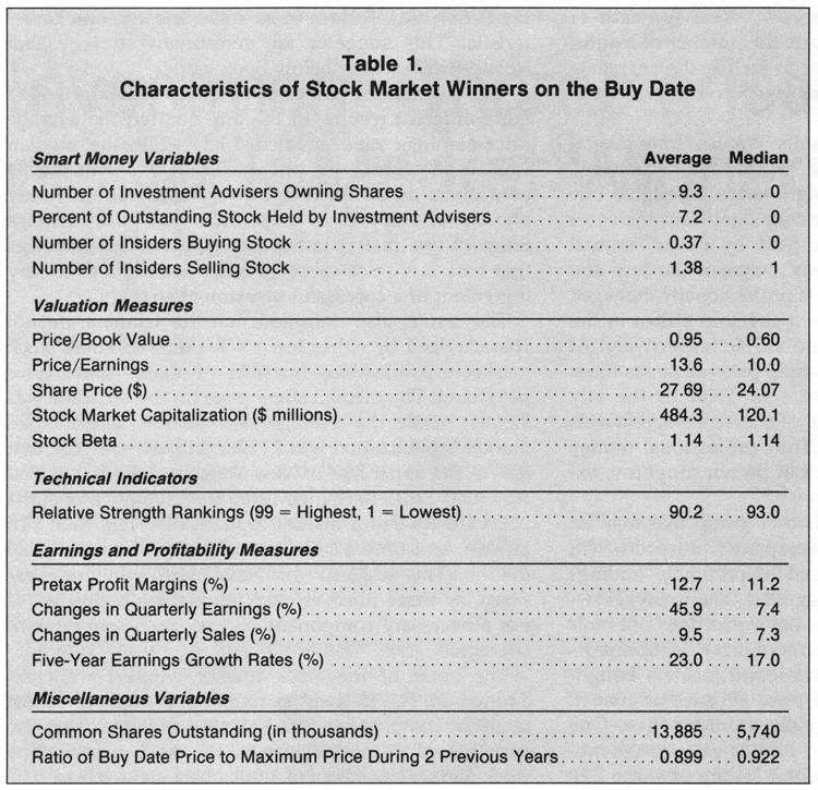
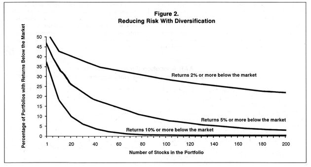
Within the stock portion of the portfolio, stock selection can add significant value and a disciplined approach to stock selection can deliver large returns.

Cryptocurrencies

Could This Be the Time to Buy Cryptocurrencies ?

Bitcoin and other cryptocurrencies have enjoyed a bull market recently. As Barron’s noted,

“After trading around $4,000 for the first three months of 2019, Bitcoin took off at the beginning of April and almost doubled in a month and half, briefly trading above $8,000 [last week].

Then, Bitcoin’s price suddenly fell 9.5%, dropping from $7,720.90 to $6,985.13 in the space of 30 minutes. Bitcoin recently traded at $7,170.

“The level of the pullback is actually picture perfect. So far, the top cryptoassets have come down about 10 [percent] from their recent highs,” Mati Greenspan, an analyst at the trading company eToro, said Friday morning.

If Bitcoin’s slide “stops soon and turns around,” he said, “there is virtually no major resistance on the chart until $20,000.”

Bitcoin’s sharp rise over the last few weeks has been attributed by some analysts to the ongoing U.S.-China trade war.

Harpal Sandhu, chairman of Mint Exchange, told Barron’s earlier this week that based on the trade flows he has observed, investors in China have been selling yuan to move into bitcoin and other currencies ahead of a trade war. “This is capital flight coming out of China because of trade,” he said.

Bitstamp, a European exchange, blamed the crash on a massive, single seller. “A large sell order was executed on our BTC/USD pair today, strongly impacting the order book,” the company tweeted. “Our system behaved as designed, processing and fulfilling the client’s order as it was received.”

Another factor that Bitcoin analysts think helped to drive up the price is the charges filed by the New York State Attorney General Tish James against the owners of Bitfinex, a cryptocurrency exchange.

James said that Bitfinex executives raided the reserve fund of Tether, a so-called stable coin that is designed to trade at a constant value, of $850 million. Those charges, the theory goes, caused a flight out of Tether and into Bitcoin in a sort-of intra-crypto flight to safety.”

Another reason could be the possibility of a recession.

With concerns of recession mounting, now could be an ideal time to buy into the market.

Cryptocurrencies haven’t really seen a recession. Barron’s reported, “This new, decentralized asset class was born at the tail end of the housing crisis, and has yet to experience the full force of a recession or even lengthy bear market.

For years, digital assets have existed in a period of market expansion in the United States. Gross Domestic Product (GDP) has increased significantly, bringing total average GDP growth from -1.73% in 2009 to 3.138% in 2017; and unemployment has dropped from 10% to 4%, with more than two million jobs created each year for the past eight years.

Unfortunately, what’s been a positive sign for upward trends in traditional markets has had an adverse impact on the mainstream appeal of digital assets.

Because the economy has steadily improved throughout the industry’s life-span, some more casual observers have failed to fully appreciate how the intrinsic qualities of blockchain-based assets (e.g., decentralization, immutability, and bespoke structures) may benefit them.

As a result, many have erroneously assumed all digital assets are functionally interchangeable, and will all react the same way to economic fluctuations.

As is the case with any industry, companies weathering the impact of a severe market correction are, understandably, going to react differently based on their business models, leverage, and market capitalization.

That’s not to say we’ll know exactly what will happen during a recession—it’s perfectly plausible, if not likely, that there will be at least some material degree of performance correlation between various digital assets.

However, what’s more likely is that we’ll begin to see certain digital assets, each equipped with their own unique value proposition, begin to separate themselves from the pack and gain momentum as a result of their inherent structural value, not merely from speculation or the rising tide of a bullish cryptocurrencies market.

Faced with a recession, Bitcoin may serve a market function similar to that of a safe-haven commodity, rather than an equity, due to its inherent scarcity and decentrality. Bitcoin, by design, is not intended to be used as a foundation on which developers could build a platform or enterprise.

Because its supply is not controlled by any one person or entity, it’s more likely that Bitcoin will perform independently of broad market pressures (akin to how one would expect gold to react)—potentially even appreciating in value should demand for alternative forms of dependable value storage arise.

GDAX daily chart

By contrast, Ethereum is far more likely to follow market trends. That’s because its platform allows other companies to build products on top of the Ethereum protocol, putting significant onus on mainstream investors to keep products afloat.

If the investors suffer, the companies suffer, which causes Ethereum to suffer as a result. Because Ethereum is a developer-focused blockchain, it’s very much dependent on how many companies use the Ethereum platform to build their projects.

If those companies were to go out of business, Ethereum’s relevance and, subsequently, its price, would undoubtedly be affected. That’s not to say Ethereum is structured similarly to equity markets by any means, but it’s more closely entangled with equity markets than most other digital assets.

BITF daily chart

Ripple’s XRP is a payments-focused digital asset that currently has the third largest capitalization in the crypto industry. Unlike Bitcoin and Ethereum, Ripple digital currency is frequently used for frictionless financial asset transfers, functioning more as a medium of exchange than other digital assets.

Because XRP functions outside the purview of mainstream markets, it’s certainly reasonable to believe that XRP would act independently in the event of a recession. On the other hand, however, XRP’s price is also highly dependent on issuance and adoption.

If Ripple loses usership—either because its issuance was mismanaged or because other projects (such as J.P. Morgan ’s proposed coin JPM) became more popular—XRP’s value would almost surely go with it.

daily chart

This all indicates that cryptocurrencies could be worth considering. Even if the economy grows, the assets could be bargains after their extended bear market. If the recession does strike, cryptocurrencies could bounce as investors seek safe havens. That could deliver significant gains to traders in the asset class.

The bottom line is that cryptocurrencies are worth considering for both long term investors and short term traders.

Stock Picks

These Could Be the Best Recession Stocks

As the last recession, and bear market, was accelerating, a research report identified the stocks that had performed the best in downturns. The study appeared in Forbes in December 2008 which was months before the end of the bear market in March 2009.

That provides an important opportunity to review how the study held up in real time. Before doing that, we can consider the results of the study:

“We scanned Forbes’ list of the Best Big Companies in America to see which ones held up best this year and during the last recession in 2001.

We required these stocks to have a positive price change over the two most recent economic downturns–Jan. 1, 2008, to Nov. 28, 2008, and March 1 through Nov. 1 of 2001.

Our list shows a few common theories hold true. One such concept is that people will still need basic goods, such as food or consumer products, even in tough times.

Church & Dwight Co. is a perfect example. The Princeton, N.J., company, which dates back to 1846, makes a variety of cleaning products and personal care items under its Arm & Hammer brand.

General Mills and Ralcorp Holdings , which both process breakfast cereal and other food items, also show share price gains during the past two recessions.

Another common belief is that with fewer dollars to spend, shoppers will seek bargains. Family Dollar Stores, Ross Stores and Wal-Mart Stores all fit this mold.

Buying items in bulk is another way to save in tighter times, an area in which BJ’s Wholesale Club specializes.

One theory that has not held up, especially in 2008, is that financial services are a safe place to invest during a downturn. We have only identified one Platinum 400 bank, Hudson City Bancorp that met our screening criteria.”

The companies identified are shown in the table below.

stock picks

Source: Forbes

Prices as of Nov. 30, 2008.

*March 1, 2001, through Nov. 1, 2001.

**Jan. 1, 2008, through Nov. 30, 2008.

***The ending value of $100 invested in the stock, divided by the ending value of $1 invested in the S&P 500.

Based on the cutoff date of the study, it is possible to see how the stocks fared in the bear market that laid ahead of them at the time the study was published. The S&P 500 was, in hindsight, far from a bottom with the recovery more than three months away. Stocks would fall more than 20% after this study was published.

It is not possible to recreate all the history because of limitations of data. Not all companies are still traded.

BJ’s Wholesale Club Holdings, Inc. (NYSE: BJ) was taken private after the recession ended and is now trading again, since last September. The break in trading history limits the ability for analysis of how the stock held up in 2009.

Cephalon was acquired by Teva, and again is not available for analysis. Family Dollar Stores was subsequently acquired by Dollar Tree.

Other stocks on the list that were acquired include Genentech, Hudson City Bancorp, Panera and Ralcorp.

Church & Dwight Company (NYSE: CHD) lost a little more than 30% in the 2008 – 2009 selloff, significantly less than the S&P 500 Index which lost about 55% over that time.

CHD weekly chart

Flowers Foods, Inc. (NYSE: FLO) also lost less than the S&P 500 but still suffered a significant loss.

FLO weekly chart

General Mills, Inc. (NYSE: GIS) is shown next.

GIS weekly chart

Hasbro, Inc. (Nasdaq: HAS), Ross Stores, Inc. (Nasdaq: ROST), The Kroger Co. (NYSE: KR) and Walmart (NYSE: WMT) all loss less than the S&P 500 with WMT faring the best, losing just about 27%.

Spartan Stores is now known as SpartanNash (Nasdaq: SPTN). The stock lost more than S&P 500 during the bear market.

SPTN weekly
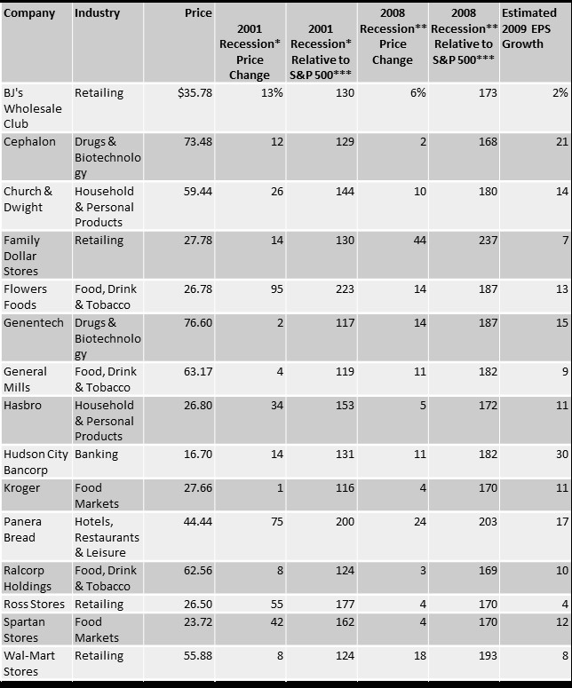
This brief look at the data shows the problem with trying to profit in a recession and a bear market. History shows that the average bear market decline associated with a recession is about 35% and most of the stocks trading in 2008 and 2009 lost at least that much.

An interesting conclusion from the study of the winners in the 2001 recession is that no two recessions are alike. Stocks that showed gains in the bear market that began in 2000 failed to do so in the next recession.

Investors are often reminded that past performance is not a guarantee of future performance and this means no investment manager is guaranteed to deliver results in the future that mirror the results of the past. That fact does seem to be well understood.

But stocks are also unlikely to perform the same in the future as they did in the past. The winners in the last recession, or in the recession before the last recession, may not be the winners in the next recession.

That actually makes sense since not all recessions are alike. In 2000, the recession followed a bubble in internet stocks and technology stocks were among the worst performers in that bear market. But that recession was relatively mild and the recovery began in a fairly normal manner.

Efforts to jump start the recovery after the next recession were anything but normal. Interest rates were cut to 5,000 year lows, not just in the United States but in major economies around the world. That recession was preceded by a financial crisis, with the home mortgage market being a central focus of the financial damage.

The differences in those two recession and recoveries make it obvious that the next recession and recovery will be different. It is extremely unlikely subprime mortgages will create a global credit crisis in the future. Regulators around the world have taken steps to guard against that.

Yet, there is a future crisis that regulators have failed to foresee. That is not a fault of the regulators who are doing all they can. It is simply the nature of a crisis. It must be unforeseen or else prudent regulators, business executives and investors would avoid the problem.

Stock market strategies

How to Really Read Chart Patterns

Charts have been used by traders for hundreds of years. The practice was widespread by the early 1900s when many of the patterns traders spotted in charts had been given names, much like ancient civilizations had given names to clusters of stars they believed looked like lions and archers.

In 1930, Forbes magazine editor Richard Schabacker published the Stock Market Theory and Practice, the first book cataloguing chart patterns. From there, an explosion of interest in patterns developed.

In 1948, Robert Edwards and John Magee published Technical Analysis of Stock Trends, a book still considered to be the authoritative reference of chart patterns. There really hasn’t been anything new written about patterns in almost 60 years and the old rules laid out by 1948 are still widely followed.

One example will show how Edwards and Magee described patterns. They wrote that a head and shoulders consists of three peaks in price occurring at the end of the uptrend, with the center peak being higher than the other two.

The two “side” peaks should be about equal in height. The three peaks give the pattern its name, with the center being the head and the right and left shoulder forming on either side of the head. Connecting the bottom of the peaks gives us the neckline.

When prices break below the support level drawn as the neckline, we have a sell signal because that indicates the uptrend is reversing. A picture is easily worth 1,000 words here, so the chart below shows the pattern. It’s a chart of the top that preceded the 2008 bear market.

SPY weekly chart

This is a chart of SPDR S&P 500 ETF (NYSE: SPY) in 2007. The head of the head (H in the chart) marked the exact high in the stock market. The shoulders are not perfect but no pattern will ever unfold perfectly. The left shoulder (LS) is part of the uptrend followed by a normal pullback.

The uptrend resumes after the pullback and the move to a new high results in the formation of the head. We then see another pullback before a rally that fails to set a new high which is the right shoulder (RS). A break of the neckline indicates the trend is over but we often see a “throwback” or a rally that fails before reaching the high of the right shoulder.

The key element of any pattern could be a degree of symmetry. For this idea, the picture below is worth a few thousand words.

SPY weekly chart

The blue and green rectangles highlight market action that is slightly similar, at least from a subjective perspective. In the rectangles we see two pullbacks that moved below the neckline briefly. The two rectangles are the same size, showing the price action took a similar amount of time to unfold.

The symmetries here are very rough but the purple line shows a high degree of symmetry. The lines drawn at angles from the neckline are the same length showing the distance from the neckline is roughly equal to the initial decline in price after the neckline was broken.

This symmetry is consistent in all patterns and is the most important point of any pattern you spot. The height of the pattern provides a tool to find price targets.

Another characteristic of a pattern is the existence of support or resistance. In the head and shoulders we saw support at the neckline. All patterns are simply defined as price action bounded by two lines and these lines could also be called support or resistance.

This is true for a falling wedge, a rectangle, a cup with handle, a triangle or any other pattern. No matter what the pattern is, the distance between those two lines is the important point of the pattern. We should expect prices to move at least that distance when the price breaks out of the pattern.

 Here’s another example, using a recent chart of iShares MSCI United Kingdom ETF (NYSE: EWU).

EWU weekly chart

Because chart patterns are subjective, the name of the pattern will not be important. We could call the highlighted area a double top. What is important is that the pattern is about $4 high. That’s found by subtracting the top from the bottom.

This doesn’t need to be precise. Patterns are imprecise and should be used as guidelines so being off by a few cents won’t affect your analysis.

To find a target, after prices break out of the pattern, subtract the height of the pattern ($4) from the bottom of the pattern. That’s shown in the chart and the decline stopped at the target. This gave a clear buy signal.

While patterns are usually found with a visual approach, patterns can also be identified in objective terms, as I mentioned earlier.

MIT professor Andrew Lo defined a head and shoulders chart pattern as price action where “the magnitudes and decay pattern of the first twelve autocorrelations and the statistical significance of the Box-Pierce Q-statistic suggest the presence of a high-frequency predictable component in stock returns.” 

The important part of his definition is simply that the pattern can be described in terms that can be programmed. This makes it testable.

In Foundations of Technical Analysis: Computational Algorithms, Statistical Inference, and Empirical Implementation, working with Harry Mamaysky and Jiang Wang, Lo found that the head and shoulders pattern, when combined with several other indicators does “provide incremental information and may have some practical value.”

This is not high praise but it does indicate there is no need to ignore patterns. Other researchers have reached similar conclusions when testing a variety of patterns. In general, they find patterns work sometimes and can be useful as part of a trading strategy.

This leads to our conclusion which is that charts could be one input in an analysis. It’s best to look for an area on the chart where support and resistance is obvious. Then identify a price target and trade when the breakout occurs.

Don’t worry about what the chart pattern is called since all price objectives are found with the same technique. The true value of charts is that they are one of the few tools that allows traders to quickly develop price targets and that can allow for trading with increased confidence.

Stock market strategies

Can This Trick Really Help Your Portfolio?

It’s often described as the “only free lunch in investing.” Diversification is defined as “a risk management strategy that mixes a wide variety of investments within a portfolio.

The rationale behind this technique is that a portfolio constructed of different kinds of assets will, on average, yield higher long-term returns and lower the risk of any individual holding or security.

Diversification strives to smooth out unsystematic risk events in a portfolio, so the positive performance of some investments neutralizes the negative performance of others. The benefits of diversification hold only if the securities in the portfolio are not perfectly correlated—that is, they respond differently, often in opposing ways, to market influences.

Studies and mathematical models have shown that maintaining a well-diversified portfolio of 25 to 30 stocks yields the most cost-effective level of risk reduction. The investing in more securities generates further diversification benefits, albeit at a drastically smaller rate.”

Rather than relying on general rules of thumb like buying 25 to 30 stocks, the American Association of Individual Investors studied the question of diversification. This is an older study but covers the question well.

The study began with “an analytical assessment of investment risk” which “begins by breaking total uncertainty into two components: the general risk of variations in the market return and the specific risk of variation in individual stock returns. 

Figure 1 indicates the magnitude of this second component of risk by showing the tremendous variation in the rates of return of the 1,528 stocks listed on the New York Stock Exchange during 1988. The horizontal axis shows the rate of return consisting of dividends and capital gains, and the vertical axis reports the percentage of stocks that achieved those returns.

distribution of NYSE stock returns
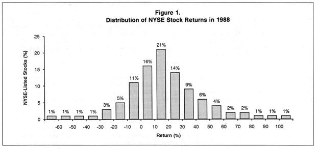
The graph indicates that 21% of all stocks produced returns that ranged between 10% and 20%. A 51% majority of stocks had returns between 0% and 30%. For the 1,528 stocks listed on the New York Stock Exchange for the entire year, the average return was 19%.

There is nothing that investors can do about general market uncertainty. Individual investors simply have to accept the risk associated with swings in the market if they are investing in the stock market and desire the returns related to this risk.

The specific risk of choosing particular stocks, on the other hand, can be reduced with diversification. Spreading an investment over many stocks reduces the chances of a return substantially below the market average. The probability of all the stocks doing poorly is small, and the negative effects of a few bad choices are diluted within the large portfolio.

The practical problem is simply determining how many stocks are necessary in order to achieve the benefits of diversification. The conventional wisdom based on a number of analytical studies is that investing in only 15 to 20 stocks provides the benefits of diversification.

This advice reinforces the “law of small numbers” intuition that a small sample of stocks will accurately reflect the overall result of the stock market. In fact, investing in 15 to 20 stocks does not nearly exhaust the risk-reducing advantages of diversification.

Many investors will choose to invest in far more than 20 securities in order to reduce risk to an acceptable level.

The information in Figure 2 allows an investor to make an informed choice about the appropriate level of diversification and risk.

This graph shows the returns for all possible portfolios drawn from the 1,528 securities listed on the Big Board. The horizontal axis indicates the number of stocks in the portfolio, and the vertical axis shows the percentage of these portfolios with a return substantially below the market.

reducing risk

How Do You Interpret These Results? 

Figure 2 demonstrates that 10% of all portfolios consisting of 20 stocks had returns that were below the market average by 10% or more. Moreover, 26% of these 20-stock portfolios were under the market by 5% or more and 40% by 2% or more.

Clearly, there is a substantial amount of risk that can be avoided by diversifying beyond 20 stocks. An investor willing to accept only a 10% chance of missing the market by 5% or more needs to diversify across 80 stocks.

Put another way, the closer an investor wants to get to the market rate of return, the more diversification is necessary: An investor willing to accept a 30% chance of missing the market by 5% or more can diversify among only 18 stocks, but if the investor wants a 30% chance of missing the market by only 2%, he must diversify among at least 90 stocks.

Figure 2 shows that, compared to investing in only one stock, diversifying across 20 stocks produces a substantial reduction in risk: The chance of a return 5% below the market falls from 47% to 26%.

However, adding 20 more stocks (for a total of 40 stocks) to the portfolio only reduces the risk from 26% to 18%. The fact that reductions in risk are increasingly difficult to achieve is the source of the conventional wisdom that 20 stocks adequately provide the benefits of diversification.

Some analysts see the slow reduction of risk apparent in the graph and conclude that diversification beyond a small number of securities is not worthwhile.

A far better conclusion is that the slow rate necessitates diversification across a large number of stocks in order to eliminate the substantial amount of specific risk. 

Figure 2 demonstrates that the law of small numbers is not valid; in fact, investing in a large number of stocks is necessary to approximate the performance of the market with some reasonable degree of confidence.”

But, is this practical for an individual investor? Is it really possible to invest in 80 or more individual stocks and understand the companies while having time to monitor the progress of each stock? Even with portfolio management tools, that could be a daunting task.

However, if the goal is to match the market diversification is needed. But the great investor Warren Buffett famously stated that “diversification is protection against ignorance. It makes little sense if you know what you are doing.”

If your goal is to beat the market, risk may need to be accepted and diversification may not be the best course of action.

Stock Picks

Cheap Gold Miners

Gold prices have been in a trading range for some time and could be considered bullish based on the chart. Prices are near the upper end of the range and holding above an important support level that has been in place since late 2017.

Gold weekly chart

Investors value gold for many reasons. Some see the yellow metal as protection against economic collapse. These investors tend to accumulate physical gold as coins or bars believing they will be able to use their gold to prosper under extremely adverse economic or social conditions.

Other investors believe the financial system will continue to function in the future but acknowledge gold tends to rise under adverse conditions and maintain positions in the metal through investment accounts owning ETFs, futures or gold mining stocks.

Some investors simply view gold as a trading vehicle to be bought in up trends and sold in down trends.

Of course, it is possible to directly trade gold. This can be done with coins, ETFs or futures. Coins are collectibles and can have tax consequences that are different than investments in stocks.

Many investors are surprised to learn popular ETFs that back their shares with physical holdings of precious metals face taxes at the higher rate for collectibles. This includes SPDR Gold Shares (NYSE: GLD).

Futures carry their own tax consequences and risks and many individual investors avoid these markets.

Publicly- traded stocks of gold miners offer an indirect way to invest in gold. Mining companies are taxed at the same rate as stocks which is lower than the rate for gains in GLD or other ETFs.

In addition to offering tax benefits, gold miners also offer the benefit of leverage. An example might be the best way to explain the leverage miners offer.

Let’s assume it costs a miner about $800 an ounce to produce gold and they mine 1 million ounces a year. If gold is at $1,000 an ounce, (a number used for simplicity) the company should generate a profit of about $200 an ounce or $200 million

This is a simplified example so we will assume the company has no other costs and no additional revenue. If the price of gold increase by 30%, to $1,300 an ounce, assuming the costs of production stayed the same, the miner’s profits would increase to $500 an ounce or $500 million for the company, an increase of 150%.

The miner is leveraged, in this example, 5 to 1, and benefits immensely from higher gold prices. Even smaller gains in the price of gold have a large impact on earnings. A 1% increase in gold prices (to $1,010 an ounce) results in a 5% jump in the earnings of this hypothetical mining company.

Remember, there is no free lunch in the stock market. Leverage can help increase investment returns on the upside but can cause significant losses on the downside.

A 1% decline in the price of gold could result in a 5% drop in earnings for this gold miner and we would expect the stock price to reflect the diminished earnings potential of the company. A 20% decline in gold would push the miner from a profit to a loss.

This leverage makes gold miners an excellent way to invest in gold. Buying miners when gold prices are low can lead to large gains when the price of the metal recovers.

With gold potentially poised for a breakout, now is the time to look for bargains in the mining sector.

We searched for gold miners using a free screening tool to find stocks offering value and trading under $5.

Many individual investors understand that low priced stocks could be appealing for two reasons. One reason is that the low price means they have little down side risk in dollar terms. The second reason is that low priced stocks are generally the ones that deliver the largest short term gains.

One study looked at how low priced, or cheap, stocks performed relative to more expensive stocks. The study found that cheap stocks delivered more than six times the average return of the more expensive stocks in a typical quarter.

That’s why we limited our search for potential bargains by focusing on stocks priced at less than $5 per share.

Finally, we looked for stocks with a  low price to sales (P/S) ratio, an indicator that the stock offers potential value.

One way to find stocks meeting these requirements is with the free stock screening tool available at FinViz.com. At this site, you could screen for a variety of fundamental factors, high levels of institutional ownership and bullish institutional transactions. An example is shown below.

Finviz screener

Source: FinViz.com

This tool is flexible and could be applied to other industries besides gold mining. Different criteria, both fundamental and technical could also be applied.

Remember, there is no guarantee any stock will increase in value. Also, it is important to remember when we search for stocks using quantitative measures, our goal is to identify stocks that meet those criteria. The screens we develop could be used as the cornerstone of long-term investment strategies but any individual stock in the list could be a winner or loser.

Our search identified nine miners meeting these requirements.

stock picks

Source: FinViz.com

Any of these stocks could be a potential winner and all worth further research. They are cheap enough in price that an investor could consider a diversified investment in gold miners to benefit from higher prices in gold.

They are also cheap in value, at least when value is measured by the P/S ratio. However, there are still risks with any stock and traders could consider stops to protect against large losses. An initial stop is often used to mitigate the risk of the stock not moving in the intended direction.

After a time, if the stock does move higher, investors can consider a trailing stop to potentially preserve profits and offer a disciplined strategy for exiting trades to move assets into other potential investments that could offer greater potential rewards.