Reading a Cloud Chart
Ichimoku Cloud charts are a popular tool for analysts, perhaps because they are visually appealing.
The most prominent feature on the chart is the shaded areas. These are the Clouds. There are actually five components of the chart and the construction of the Cloud Chart can be summarized as follows:
- Turning Line, which is the midpoint of the high and low of the last 9 sessions.
- Standard Line which is the midpoint of the high and low of the last 26 sessions.
- Cloud Span A is the midpoint of the turning line and the standard line and is shifted forward by 26 bars.
- Cloud Span B is the midpoint of the high and low of last 52 sessions and is also shifted 26 bars forward.
- The Lagging Line is the price line the (the closing price) shifted backwards by 26 bars.
Each of these components is also known by other names. The Turning Line is called the Tenkan-sen or the Conversion Line in some sources. The Standard Line is the Kijun-sen or Base Line. The Lagging Line is also known as the Chikou Span or the Lagging Span.
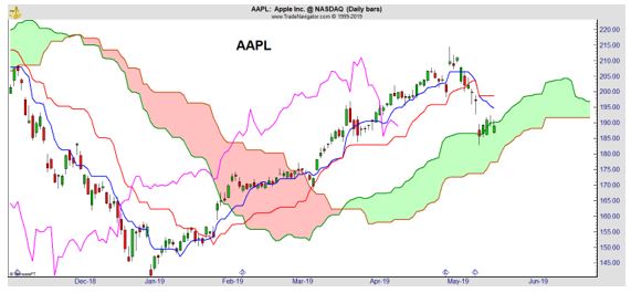
Now let’s look at how to analyze the chart of Apple (Nasdaq: AAPL) shown above. It can be confusing to look at the chart because there are several pieces of information. With experience, many traders like having a large amount of information available at a single glance.
With less experience, the chart can be overwhelming. To cut through potential confusion, we will look at that chart in three steps. In the first step, we will look only at the clouds and then we will address the interpretation of the various lines.
Because the chart is less confusing, we have compressed the time to show more signals. With just the Clouds, interpretation is easy. When prices are above the Cloud, the chart is bullish. When prices are below the Cloud, the chart is bearish.
When prices are in the cloud, the answer is not clear but we should expect the previous trend to resume. Right now, prices entered the Cloud from above so we should expect AAPL to resume its uptrend.
The chart above shows these signals are clear enough that they can be traded. Sell when prices fall below the lower span of the loud and buy when prices break above the upper line of the Cloud. This is similar to a trading strategy using moving averages (MAs).
One problem with any MA is that signals come after the trend has reversed and you need to capture long-term trends to make up for the delays in the signals. Another problem with MAs is that there will inevitably be a number of whipsaw trades.
A whipsaw trade is one that lasts a short time before being reversed. These trades usually result in small gains or losses but trading costs can add up. These costs are generally overcome with an MA strategy because you will eventually be on the right side of a long-term trend.
Clouds should also deliver profits from long term trends but they will suffer from lags in signals and whipsaw trades while waiting for the big winners that are generally needed to make a trend following system successful.
This is an important point. Any individual trading decision based on Clouds can be wrong. There could be several losing signals in a row. It generally requires discipline to take 100% of the signals and a long-term commitment to profit from Clouds or any trend-following strategy.
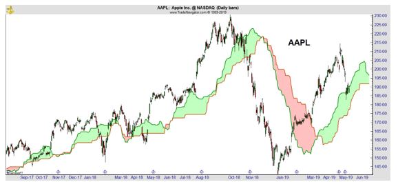
In the chart above, we see that AAPL dropped below the lower line of the Cloud in the middle of November. This is bearish and it will take a break above the upper line of the Cloud for AAPL to turn bullish with this indicator.
The next chart removes the Cloud Spans and includes only the Turning Line and the Signal Line.
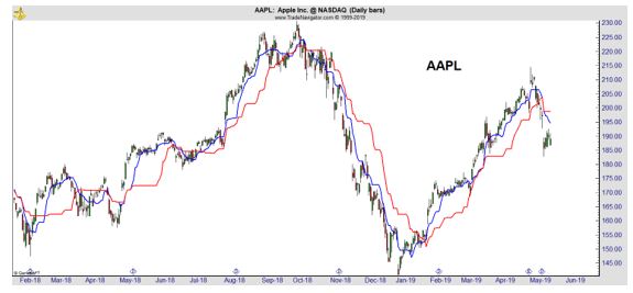
These lines are moving averages and should be interpreted in the same way any MA would be interpreted. When the faster moving average is above the shorter average, the chart is bullish. In this case, that would mean the Turning Line is above the Standard Line.
When the shorter MA is below the longer MA, the chart is bearish. In the chart above, the Standard Line, the longer moving average that uses 26-bars instead of 9 in its calculation, is shown in red. In the chart above, when the red line is on top, the chart is bearish.
From the chart above, you can see this system does a nice job providing buy and sell signals. Right now, AAPL is bearish on this reading.
Many traders will prefer a simpler approach than Clouds. A simple MA system, maybe buying when the 50-day MA crosses above the 200-day MA and selling on a downside cross, could be easier to trade. There would be only one signal to watch in that system.
With Clouds, traders have three signals to watch:
- Relationship of the closing price to the Cloud Spans; if the close is above the Clouds, the signal is bullish and when the close is below the Clouds the signal is bearish.
- The position of the Turning Line to the Standard Line.; when the Turning Line is above the Standard Line, the signal is bullish and when the Turning Line is below the Standard Line the signal is bearish.
- The position of the Lagging Line to the Cloud Spans; buy signals are given when the line is above the Cloud and a sell signal is given when the line is below the Cloud.
A trader could trade when all three signals agree or when two of the three agree or in some other way. You could also pick one of the three signals and base all decisions on that indicator, ignoring the other components of the Clouds.
Related post: Sex Drive Boosters for Men: Evidence-Based Approaches to Revitalize Libido
The important point, as it is with any indicator, to apply the same rules consistently. If you are consistent and disciplined, Clouds could deliver gains in the long run.