Stock market

Understanding the Stock Market as a Game

There are differences, as we all know, between playing golf as a weekend player and a professional. These differences can be explained as the difference between a loser’s game and a winner’s game. That same difference can be used to understand why some traders win and others lose.

In his classic paper The Loser’s Game, Charles Ellis wrote,

“Simon Ramo identified the crucial difference between a Winner’s Game and a Loser’s Game in his excellent book on playing strategy, Extraordinary Tennis for the Ordinary Tennis Player. Over a period of many years, he observed that tennis was not one game but two.

winning the loser's game

One game of tennis is played by professionals and a very few gifted amateurs; the other is played by all the rest of us. Although players in both games use the same equipment, dress, rules and scoring, and conform to the same etiquette and customs, the basic natures of their two games are almost entirely different.

After extensive scientific and statistical analysis, Dr. Ramo summed it up this way: Professionals win points, amateurs lose points.

Professional tennis players stroke the ball with strong, well aimed shots, through long and often exciting rallies, until one player is able to drive the ball just beyond the reach of his opponent. Errors are seldom made by these splendid players.

Expert tennis is what I call a Winner’s Game because the ultimate outcome is determined by the actions of the winner.

Victory is due to winning more points than the opponent wins – not, as we shall see in a moment, simply to getting a higher score than the opponent, but getting that higher score by winning points.

Amateur tennis, Ramo found, is almost entirely different. Brilliant shots, long and exciting rallies and seemingly miraculous recoveries are few and far between.

On the other hand, the ball is fairly often hit into the net or out of bounds, and double faults at service are not uncommon. The amateur duffer seldom beats his opponent, but he beats himself all the time. The victor in this game of tennis gets a higher score than the opponent, but he gets that higher score because his opponent is losing even more points.

As a scientist and statistician, Dr. Ramo gathered data to test his hypothesis. And he did it in a very clever way. Instead of keeping conventional game scores – “Love,” “Fifteen All.” “ThirtyFifteen.” etc. – Ramo simply counted points won versus points lost.

And here is what he found. In expert tennis, about 80 per cent of the points are won; in amateur tennis, about 80 per cent of the points are lost.

In other words, professional tennis is a Winner’s Game – the final outcome is determined by the activities of the winner – and amateur tennis is a Loser’s Game – the final outcome is determined by the activities of the loser.”

Ellis concluded, and a recent article in Institutional Investor confirmed that “Investing in public markets has become a loser’s game, and probably has been for a long time.”

This shift is seen in asset flows to passive managers.

Top five asset managers

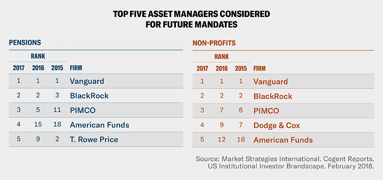
Source: Institutional Investor

Beating the Market

In simplest terms, the experts are telling the average investor to follow the well known advice “if you can’t beat them, join them.” This means passive index funds are increasingly popular and that sets up an interesting dilemma that individual investors must consider:

If the stock market declines by 50%, is it really your goal to lose 50%?

Remember that the stock market has declined by 50% twice in the still young 21st century.

SPX monthly chart

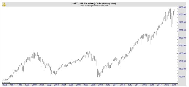
Investors often seem to forget about those brutal losses in bull markets. The experts begin explaining that it is impossible to beat the market in the long run and highlight bull market returns. When bear markets are considered, active strategies can be useful.

In A Quantitative Approach to Tactical Asset Allocation, Meb Faber noted,

“In his 2008 book Stocks for the Long Run 5/E: The Definitive Guide to Financial Market Returns & Long-Term Investment Strategies, Jeremy Siegel investigates the use of the 200-day SMA in timing the Dow Jones Industrial Average (DJIA) from 1886 to 2006.

His test bought the DJIA when it closed at least 1 percent above the 200-day moving average, and sold the DJIA and invested in Treasury bills when it closed at least 1 percent below the 200-day moving average.

He concludes that market timing improves the absolute and risk-adjusted returns over buying and holding the DJIA. Likewise, when all transaction costs are included (taxes, bid-ask spreads, commissions), the risk-adjusted returns are still higher when employing market timing, though timing falls short on an absolute return measure.”

Faber then tested an even simpler strategy using the 10 month moving average. His results are shown below.

total returns vs. timing total returns
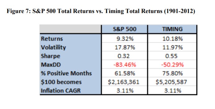
Source: A Quantitative Approach to Tactical Asset Allocation

Notice that the simple timing model beat the long term passive investment model. That’s because of the important impacts bear markets have on long term performance.

Faber explains, “All of the G-7 countries [G-7 countries are the world’s largest developed economies] have experienced at least one period where stocks lost 75% of their value.

The unfortunate mathematics of a 75% decline require an investor to realize a 300% gain just to get back to even – the equivalent of compounding at 10% for 15 years!”

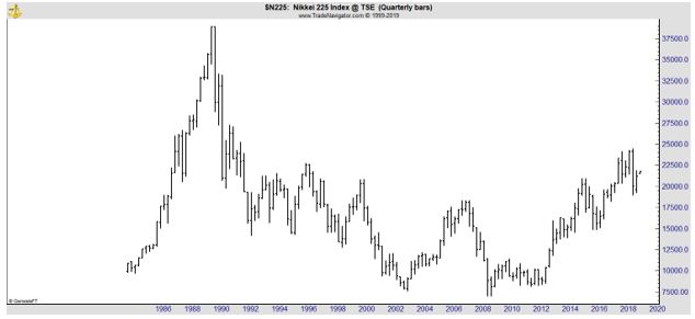
A 50% loss requires a 100% gain just to get back to even. That could take many years or even decades. To this, the passive investment advocates note that stock prices always come back and that advice requires ignoring Japan which is not really an anomaly.

Japanese stocks peaked in 1989 and remain well below that all time high. In fact, after thirty years, the benchmark average for that country remains more than 40% below its all time high. Ignoring that reality places an individual’s retirement at risk. That is irresponsible and yet, many investment experts insist that risk should be ignored.

Given the high level of risk and life changing consequences, buy and hold passive investing might be too risky for almost all individual investors.

Stock Picks

This Precious Metal Could Be a Buy Right Now

Gold is often considered an investment, but others might believe it is more. The Asia Times recently noted, “gold quietly shapes our world.”

Gold is “very useful in medicine in the form of gold-containing drugs.

There are two classes of gold drugs used to treat rheumatoid arthritis. One is injectable gold thiolates – molecules with a sulfur atom at one end, and a chemical chain of virtually any description attached to them – found in drugs such as Myocrisin, Solganol and Allocrysin.

The other is an oral complex called Auranofin.

Gold is also increasingly being used in nanotechnology. A nanomaterial is generally considered a material where any of its three dimensions is 100 nanometers (nm) or less.

Nanotechnology is useful because it is not restricted to a particular material – any material could in principle be made into a nanomaterial – but rather a particular property: the property of size.

For example, gold in its bulk form has a distinct yellow color. But as it is broken up into very small pieces it starts to change color, through a range of red and purple, depending on the relative size of the gold nanoparticles.

Such nanoparticles could be used in a variety of applications, for example in the biomedical or optical-electronic fields.

Another exciting advancement for gold in nanotechnology was the discovery in 1983 that a clean gold surface dipped into a solution containing a thiolate could form self-assembled monolayers. These monolayers modify the surface of gold in very innovative ways.

Research into surface modification is important because the surface of anything can show very different properties than the bulk (that is, the inside) of the same material.

Gold nanoparticles have also proven to be an effective catalyst. A catalyst is a material that increases the rate of a chemical reaction and so reduces the amount of energy required without itself undergoing any permanent chemical change.

This is important because catalysis lies at the heart of many manufactured goods we use today. For example, a catalyst turns propylene into propylene oxide, which is the first step in making antifreeze.”

As an investment, some analysts believe now is an ideal time to buy gold. Kitco reported,

“Gold prices holding firmly above strong support at $1280 this year, even as the U.S. dollar’s strength has weakened gold’s currency component, is a testament to the metal’s institutional support. According to the World Gold Council, central banks added the highest level of gold reserves in 2018 in over 50 years.

China’s central bank also increased its gold reserves to 60.62 million ounces in March from 60.26 million in February. China has previously gone long periods without revealing increases in gold holdings.

When the central bank announced a 57 percent jump in reserves to 53.3 million ounces in mid-2015, it was the first update in six years. The latest pause was from October 2016 until December last year.

… the fundamental and technical factors I have mentioned in recent missives could still propel the gold price higher by later this spring.”

Barron’s noted that silver could be the better investment.

“It is difficult to be pessimistic about silver at these levels,” with prices that don’t provide an incentive to boost supply, says Maria Smirnova, senior portfolio manager at Toronto-based Sprott Asset Management.

“We expect silver to outperform gold,” says Smirnova. “Silver has lacked retail investment demand, so a sustained rally in gold will lead to the speculators coming and buying silver.”

Silver monthly chart

Total physical demand for silver rose 4% last year, to a three-year high of 1.03 billion ounces, according to the Silver Institute’s World Silver Survey, compiled by a team at financial data and analytics provider Refinitiv.

The report … showed that global industrial silver demand fell 1% last year, to 578.6 million ounces. All told, silver’s physical market posted a “minor deficit” of 29.2 million ounces in 2018 which is considered to be close to in balance.

Dow Jones Commodity Index

Source: Barron’s

Smirnova expects industrial demand to “remain stable, despite slower [economic] growth.” A recent forecast from the International Monetary Fund revealed expectations for global economic expansion of 3.3% this year, down from an estimated 3.5% in January.

“Silver does not represent large components of end products,” Smirnova explains, pointing out that electronics, cars, and medicines don’t use a lot of the metal per unit, so an economic slowdown probably won’t have a big impact on it. Its use in solar applications is also “insulated from economic growth” because that market is “more driven by government incentives and the need for renewable energy.” Instead, it’s the “return of retail investment demand [that] will be the driving force behind an increase in the silver price,” Smirnova predicts.

The World Silver Survey found that global investment in silver bars and coins grew 20% last year, with bar demand alone up 53%. The study also revealed a third consecutive annual decline in global production of the metal. It fell 2% in 2018, to 855.7 million ounces.

“Silver is cheap, at $15 [an ounce] as it is not encouraging new supply,” says Smirnova. “Primary mines are not generating a lot of cash at these levels or are losing money.”

Still, some analysts urge caution. Adam Koos, president of the Libertas Wealth Management Group, believes that silver is a “wait-and-see game” right now. However, he has recently detected “momentum [for gold] waning in favor of silver.”

Given that, he wouldn’t be surprised to see a “changing of the guard at some point in 2019, putting [silver] in the lead.” Koos adds, however, that he’d want to see prices break above $16 before risking any “serious capital.”

Investors seeking exposure to physical silver can consider Sprott Physical Silver Trust (ticker: PSLV), which Smirnova manages. Those interested in silver stocks might want to look at the Ninepoint Silver Equities Class funds, which are subadvised by Sprott Asset Management.

Exchange-traded funds focused on the metal include the iShares Silver Trust (SLV), as well as Global X Silver Miners (SIL) and Aberdeen Standard Physical Silver Shares (SIVR).

Retirement investing

A Hidden Problem For Retirement Planning

Retirement planning is a significant challenge to many investors.  They must decide how much to save now to allow them to retire later and that problem involves assumptions about potential returns, the sequence of returns or the risk, the rate of inflation and the length of time the assets will need to be used for.

The Wall Street Journal recently highlighted the problem in terms that are facing government agencies around the country, “The pressures are coming from a slate of problems, and the longest bull market in U.S. history has failed to solve many of them.

There is a simple reason why pensions are in such rough shape: The amount owed to retirees is accelerating faster than assets on hand to pay those future obligations. Liabilities of major U.S. public pensions are up 64% since 2007 while assets are up 30%, according to the most recent data from Boston College’s Center for Retirement Research.

Here is how it got that way:

The Financial Crisis Happened

10-year returns on pension funds

Source: The Wall Street Journal

Public pension funds have to pay benefits—their liabilities. They hold assets, which grow or shrink through a combination of investment gains or losses and contributions from employers and workers. Those assets generally rose faster than liabilities for five decades starting in the 1950’s because government was expanding and the number of retirees was smaller.

In the 1980’s and 1990’s, double-digit stock and bond returns convinced governments they could afford widespread benefit increases.

But the value of their holdings—their assets—began to fall in the aftermath of the dot-com bust in the 2000’s, and the 2008 financial crisis followed soon after. State and local retirement systems lost 28% in 2008 and 2009, according to the Boston College data.

liabilities and assets for public pensions

Source: The Wall Street Journal

“The first thing you have to do is make up what you lost,” said Sandy Matheson, executive director of the Maine Public Employees Retirement System. “And it takes years. And then you have to make up what you didn’t earn on what you didn’t have. It’s a pretty steep climb.”

Governments Fell Behind on Their Payments

Cities and states set out to ramp up their yearly contributions to public pension funds as a way of making up for their investment losses.

spending on public pensions

Source: The Wall Street Journal

Some were able to keep up with those payments. But others weren’t as they struggled with lower tax revenue and increased demand for government services in the aftermath of the 2008 crisis. New Jersey made less than 15% of its recommended pension payment from 2009 through 2012. It now has a little more than one-third of the cash it needs to pay future benefits—despite robust investment returns in recent years.

These same problems could trip up individual investors.

Barron’s recently noted, The two most crucial questions in retirement planning—how long are you likely to live, and how much of your life will be spent in relatively good health?—have long been dismissed as unknowable.

But thanks to facial analysis, gene testing, and other new technology, advisors and investors may finally be able to get answers that meaningfully change the way they navigate saving for and living in retirement. And it has as much to do with your health as it does your portfolio.

Lifespan is arguably the crux of all financial planning, especially how much an individual should save for retirement, and how much he or she can safely spend once retired. It can also influence decisions related to timing Social Security benefits, buying annuities, and getting long-term care insurance.

Most people rely on crude tools, wild guesses and wishes to determine how long they’ll live. In a survey released by AIG Life & Retirement last week, 53% of respondents said their goal is to live to the age of 100.

Yet, the financial reality of living that long is daunting. In the same survey, the majority of respondents said they fear running out of money more than death itself.

The solution to managing longevity risk is to plan for it.

Lifespan tables are a starting point for many would-be retirees. But they are based on an entire population of people, and don’t take into account such factors as lifestyle, health, or family history.

Consider [an individual] who is 65. A standard lifespan table from the Social Security Administration suggests he’ll live to be 83. By his own assessment—which encompasses a number of factors, including biomarkers—he is on track to live into his 90s.

Calculators can give a more accurate read, but the results can vary dramatically depending on methodology and inputs. Anyone who goes this route should stick with a calculator that give results in probabilities rather than absolute numbers, says [one expert], who recommends the American Academy of Actuaries’ Longevity Illustrator.

Of course, life expectancy is just one component of longevity. Health span—how many of the years you have left will be spent in relatively good mental and physical health—should also be part of the equation.

“People say they want to live to be 100, but the number itself is less relevant than how healthy you are,” says ay Olshansky, a leading researcher in longevity and a professor in the School of Public Health at the University of Illinois.

Indeed, health doesn’t just determine quality of life, it is one of the single biggest wildcards for retirement planning.

This is where facial analysis—and other new technology, such as saliva-based tests for longevity genes and other biomarkers—could offer a more nuanced look at lifespan.

A new venture, Wealthspan Advisors, is gearing up to roll out a platform for advisors using the same technology that Olshansky and other researchers helped develop for the insurance industry.

Instead of simply asking clients how long they think they will live, planners ask a series of questions and take a photograph of a client’s face. From that photo, the program provides an estimate for both lifespan and health span, and illustrates how lifestyle choices will influence those outcomes.

“When you look young for your age, it usually means that you are aging at a slower rate,” Olshansky says, noting that the program isn’t fooled by makeup and cosmetic procedures.

Would-be retirees shouldn’t rewrite their financial playbook based on a single snapshot, but technology like this could offer a more accurate picture for planning.”

Stock Picks

This Could Be the Biggest Winner of the Driverless Car Revolution

Traders are excited about driverless cars. They see a tremendous investment opportunity. Driverless cars, also referred to as autonomous vehicles, are designed to sense their environment and navigate roads without human input.

Autonomous vehicles rely on technologies like GPS and radar to study their surroundings and make intelligent decisions about the car’s direction and speed. Depending on how soon the vehicles are introduced and adopted, the implications for investors are potentially large.

Automated vehicles are quickly nearing a level of maturity that will allow manufacturers to start deliveries to consumers. A large group of companies are actively developing complete automated driving systems and the components that go into those systems.

This list includes traditional auto companies, suppliers, non-automotive technology companies, and startups. Several of these companies entered this market recently but rapidly moved into contention through acquisitions, investments, and strategic hiring of key personnel.

In short it is a competitive market and there will be winners and losers. The losers are likely to outnumber the winners, a situation that has historically been the case before. Barron’s recently reviewed the market and reached a possibly surprising conclusion.

“The United Kingdom has emerged as the No. 1 location on earth to support autonomous vehicles, or AVs, in a new analysis conducted by the Society of Motor Manufacturers and Traders, or SMMT. The U.K. lobby group has calculated that it will generate an economic boost of 62 billion pounds sterling ($81.1 billion) per annum by 2030, which will boost the U.K. economy and a range of firms.

But How Can Investors Benefit?

The key is to identify the sectors most likely to profit, and then some of the investible stars that lead the way in their fields.

The car makers are an obvious choice. The automotive giants with well-advanced AV programs are Daimler ’s Mercedes-Benz, Volkswagen’s Audi, and BMW; Ford Motor (NYSE: F) and Tesla (Nasdaq: TSLA); Tata Motors (NYSE: TTM) Jaguar Land Rover; and Nissan Motor.”

A long-term chart of Ford is shown below.

F monthly chart

The stock is near multiyear lows and the concern for investors might be the market for nonelectric cars. Those cars, of course, make up the majority of the company’s business and could be a drag on Ford’s performance for some time.

A pure play in electric cars could be TSLA.

TSLA monthly chart

The chart shows the stock has delivered significant gains in the long term however the company has stumbled recently, largely on concerns that the company’s CEO, Elon Musk, is not focused enough on the company as he directs attention to other projects.

Barron’s continued, “Sajid Yacoob, head of global electric vehicles at Tata Consultancy Services, says that these stocks are well placed for growth because they are embracing change.

“When you see established OEMs [original equipment manufacturers] focus on autonomous activities, you see a bump in share prices,” he says. “This is because the market is moving away from traditional operations to this value-added business model.”

But the sectors extend to a bunch of less obvious industries—think technology, telecoms, transport, infrastructure, insurance, and legal. Once driverless cars are built, the next two vital components are telecoms and power.

AVs rely heavily on communications such as 4G and, eventually, 5G—the mobile connectivity that links them to the environment, such as intelligent traffic lights and road sensors.

Among these, Yacoob says, the strongest telecoms players are the U.K.’s Vodafone Group (Nasdaq: VOD) and EE, a joint venture between Germany’s Deutsche Telekom and Orange, formerly France Télécom.”

VOD is available in the US and the long term chart is shown below. This stock is also weighed down by the legacy business.

VOD monthly chart

Barron’s concluded, “In terms of power, most of the auto makers are developing their own battery technology. Japan’s Nissan has built its own state-of-the-art battery plant in northern Britain.

Next up are the firms developing the software and hardware that allow cars to “talk” to the roads around them. These are electronic gadgets that sit inside vehicles that use wireless internet to synchronize with similar boxes placed at traffic junctions and along highways.

Yacoob highlights Germany’s Continental, a blue-chip stock on the benchmark DAX index that is probably best known for tires but is also a leader in electronics, as well as the privately owned engineering company Bosch.

In Europe, four countries, the U.K., the Netherlands, France, and Germany, are battling to be the first to deploy these autonomous robots on the roads. They believe that the technology will unlock economic growth, jobs, and wider improvements.

The rollout of the new infrastructure and new software and hardware will generate an estimated £18 billion for firms and create about 420,000 jobs, according to the SMMT. Investors could benefit from owning a piece of the firms delivering all of this.”

With so many of the potential investments in overseas markets, investors should consider their options carefully. Many large brokers allow investors in the US to access individual stocks in overseas markets directly through their accounts.

While this could be tempting to some investors, the risks should not be ignored. Investing in stocks in other countries carries many of the same risks that investing in stocks on US markets carry. That includes company specific risks along with risks associated with the stock’s sector and the broad stock market.

These stocks carry additional risks including risks associated with currencies. One large broker notes, “U.S. stocks can be impacted by the value of the dollar relative to currencies of other countries.” And adds,

“International investments involve additional risks, which include differences in financial accounting standards, currency fluctuations, geopolitical risk, foreign taxes and regulations, and the potential for illiquid markets.”

While the risks may be acceptable to some, they must be considered, especially when investing in new technologies. Another factor that must be considered is the issue of taxes.

Investing in foreign stocks can require additional tax forms and the work involved may not be worth the effort for smaller investments. For smaller investors exchange traded funds could offer the best way to access international markets.


Stock Picks

Here’s What You Need to Know About the Next IPO

Lyft (Nasdaq: LYFT) has already started trading and Uber is capturing headlines. These are companies that were unicorns and are now transitioning to publicly traded companies after concluding initial public offerings (IPO).

A unicorn is a privately held startup company valued at over $1 billion. The term was coined in 2013 by venture capitalist Aileen Lee, choosing the mythical animal to represent the statistical rarity of such successful ventures.

A decacorn is a word used for those companies over $10 billion, while hectocorn is the appropriate term for such a company valued over $100 billion. Unicorns include Uber, Airbnb, Stripe, Palantir Technologies, and Pinterest.

Lyft wan a decacorn that turned into a public company on March 29, 2019.

LYFT daily chart

Uber is preparing to go public and capturing a great deal of attention. Another company to watch is Pinterest, the operator of a popular bulletin-board website.

Pinterest is a social media website that allows users to organize and share images and videos from around the Web. Images uploaded by users are called Pins and may be organized into pinboards, which may be customized, themed and followed by other users.

Users can also like or repin content shared by other pinners. Much like Twitter, any pinner can follow another. Pinterest represents a move toward more visual social media platforms.

Pinterest differs from many other social media platforms in that it is image-based, allowing a following to develop among those with interests that have a strong visual component. This is why Pinterest is popular for recipe sharing, interior design, fashion and online shopping.

Pinterest encourages its users to credit the sources for their images and provide a link back to them. Pinterest is mostly based around image sharing, but videos also may be shared.

According to Barron’s, “It has an attractive high-growth business, is close to profitability, and—most important—appears willing to price the deal to sell.

The talk on Wall Street late last week was that demand was strong for this week’s IPO, which would raise $1.2 billion or more, and that the pricing could be above the current range of $15 to $17 a share.

That’s below a price of more than $21 a share that Pinterest received in a round of financing from Fidelity Investments in 2017. At the midpoint of the range, Pinterest, which will list under the ticker PINS, would be valued at about $10.5 billion, based on a fully diluted share count of about 655 million shares.

Pinterest could be considered expensive by traditional financial measures, and investors are likely to compare it to richly valued internet companies like Twitter and Snap.

Pinterest is growing rapidly off a low base, with revenue up 60% last year, to $756 million and rising a projected 45% to about $1.1 billion this year.

key metrics for Pinterest

Source: Barron’s

Pinterest had more than 265 million global users at the end of 2018, including 82 million in the U.S., who compile visual bulletin boards using pinned images on such topics as home renovations, wedding planning, fashion, and cooking.

Women make up two-thirds of Pinterest’s user base, including 80% of U.S. mothers ages 18 to 64—an attractive demographic given the role that women play in household financial decisions. Pinterest writes in its prospectus that half of all U.S. millennials are users.

The company appeals to advertisers, which buy so-called promoted pins that are comparable to sponsored posts on Facebook, because users are often planning to make purchases. Pinterest calls itself “the productivity tool for planning your dreams.”

Atlantic Equities analyst James Cordwell began coverage of Pinterest with an Overweight rating and a price target of $23 a share, writing that “the company’s unique and broadly appealing proposition, offering consumers the ability to view and collate visual recommendations, will enable ongoing robust user growth.”

He expects “significant monetization upside, given the higher purchasing intent of the user base” and sees 32% compound annual growth in revenues from 2018 through 2022. One of Pinterest’s biggest opportunities—and challenges—is outside the U.S., where it generates just 8% of its revenue.

“Twitter gets almost half of its revenues outside the U.S.,” Cordwell tells Barron’s. “There is no structural reason that Pinterest can’t be as successful as Twitter.”

However, that could be a warning to investors. As the next chart shows, that stock is trading below its initial trading price.

TWTR monthly chart

Barron’s continued, “Unlike Lyft, Pinterest is close to profitability on an annual basis and operated in the black in the fourth quarter. The company lost $75 million from operations in 2018 against $911 million for Lyft. Cordwell sees non-GAAP profitability in 2019 when excluding stock-based compensation.

Pinterest, like many tech companies, is a generous issuer of restricted stock to employees, compensation that tech investors are often willing to ignore. Cordwell sees GAAP profitability in 2021.

Pinterest will probably be valued based on its revenue. Assuming an IPO price of $16, the company would be valued at eight times projected 2019 sales of $1.1 billion when factoring in its $1.5 billion in cash. Snap is valued at nine times, and Twitter and Facebook, at about seven.

Susquehanna Financial Group analyst Shyam Patil wrote that Snap’s valuation “could set the floor for Pinterest.”

But, again, that could be a warning to investors as that stock is also well below its initial trading price.

SNAP monthly chart
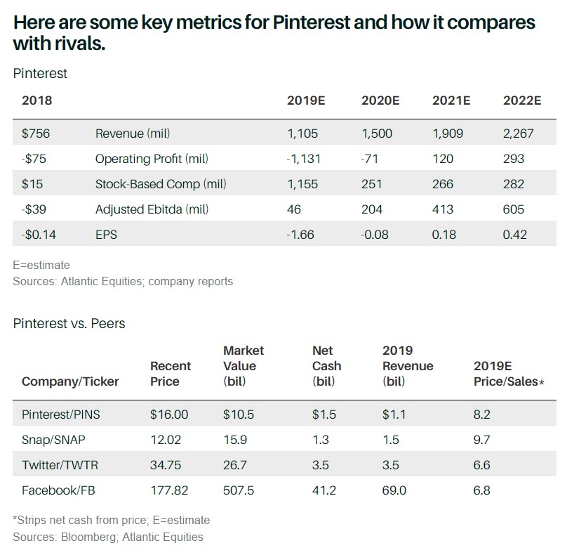
Barron’s also shared some reservations, “Among the knocks against Pinterest is engagement. The company, unlike Facebook, Snap, and Twitter, doesn’t report daily active users.
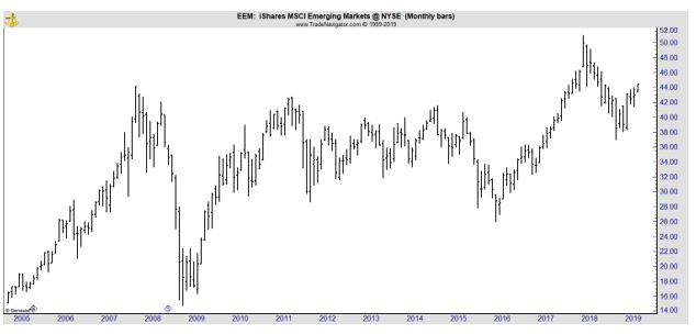
It discloses that 57% of its monthly active users go to the site each week. Analysts estimate that the ratio of daily to monthly users at Pinterest is 20% to 25%, below Twitter at about 40% and Facebook, at 65%.

Cordwell agrees that this is an issue, but it’s offset by the “high purchasing intent” of Pinterest users.

Yet investors will have no power at the company because Pinterest will issue Class A shares in the deal, while converting all shares outstanding held by earlier-stage investors, including the company’s founders, Ben Silbermann and Evan Sharp, into Class B stock with 20 votes each.

The question for Pinterest is whether it can become an important destination for online advertisers in a market dominated by Google and Facebook. Investors would like to see Pinterest become what Cordwell calls a “second tier” platform like Twitter or Snap, rather than a third-tier one like Yelp.”


Stock market

Emerging Markets Could Be a Buy, Again

Investors have heard the same call to action many times in the past. Expert analysts point out that there is one part of the world’s economy that is growing most rapidly and likely to outperform the United States and other developed markets.

They urge investors to consider emerging markets. The long-term chart below shows that the iShares MSCI Emerging markets ETF (NYSE: EEM) is near the same level it peaked at in 2007, and has consistently traded below that high for years.

EEM monthly chart

One of the keys to success in the markets is buying low, so the question becomes is now the ideal time to buy into EEM or to implement other emerging market strategies?

One Expert’s Opinion

Ruchir Sharma, chief global strategist and head of emerging markets at Morgan Stanley Investment Management, was recently featured in Barron’s. Sharma oversees the management of $20 billion for the large investment firm.

Barron’s notes that Sharma “cautioned investors at the start of the decade to avoid the overhyped BRICs—markets in Brazil, Russia, India, and China—and recommended that they look more favorably on U.S. stocks, particularly technology shares.

It was the right call, by far; the S&P 500 index has returned an average of 13% annually since the beginning of 2010, led by the tech sector, while emerging markets, in dollar terms, have been dead money.”

Looking ahead, “Sharma sees global markets at an inflection point: U.S. tech stocks and global multinationals could struggle, while emerging markets are poised for a revival.”

Emerging markets present an interesting problem for individual investors who often favor a buy and hold strategy. They were introduced to investors as a unique asset class in 1988 and have delivered a “median decline of around 17% every year since the inception of the asset class in 1988.”

They have been volatile and enjoyed some large bull market gains and some distressingly large bear market losses.

Sharma noted, “This has been a lost decade for emerging markets, from the beginning of 2010 through the end of last year. Meanwhile, the U.S. market has tripled. That is a complete reversal from the prior decade.

The U.S. is at all-time highs relative to the rest of the world in terms of trailing price/earnings ratios—levels that historically led to a mean reversion.

The U.S. dollar, which has been an important driver of these relative trends, seems to be peaking. It is at the higher end of its range in the post–Bretton Woods era [when the dollar was pegged to the price of gold, which ended in 1972]. The interest-rate differential between the U.S. and the rest of the world is also near an all-time high.

We are close to an inflection point in markets. The performance gap between the U.S. and the rest of the world is bound to narrow in the coming decade.

The U.S. today is about 55% of the global market cap, and its share of the global economy is 25%. The last time such a large gap existed was in the late 1980s, when the Japanese market was 45% of the global market cap and Japan’s economy was about 15% of the world total.

That didn’t turn out so well for Japan.” The next chart highlights exactly what that means for investors. It’s a chart of the Japanese benchmark Nikkei 225 Index.

chart of the Japanese benchmark Nikkei 225 Index

Specific Ideas

Sharma offered a number of specific ideas investors can consider.

“Consumer-staples companies in emerging markets are trading at the lowest levels I have ever seen relative to broader emerging markets.

Our portfolio managers like Fomento Economico Mexicano [ticker: FMX], or Femsa; Portugal’s Jerónimo Martins [JMT.Portugal]; Ambev [ABEV]; Wal-Mart de Mexico [WALMEX.Mexico]; and Russia’s X5 Retail Group [FIVE.UK].

Our China portfolio includes education stocks such as New Oriental Education & Technology Group [EDU], consumer stocks like China Mengniu Dairy [2319.Hong Kong] and Kweichow Moutai [600519.China], and pharmaceutical stocks like CSPC Pharmaceutical Group [1093.Hong Kong].

India tops the list of countries where we can get companies with stable earnings growth. It has the most compounders, like HDFC Bank [HDB], which we have held since its initial public offering in 1995, and car makers such as Maruti Suzuki India [MSIL.India].

The country is in the midst of elections; the only risk is a bout of competitive populism, with candidates offering one welfare scheme after another that could stretch India’s fiscal situation.”

The risks identified with stocks in India should be considered and it should be noted that all of these stocks carry risks unique to their home countries and countries they operate in, even the shares that are available on US exchanges carry these “home country” risks.

As you know, risks should always be considered when considering any potential investment opportunity.

But, We’ve Heard This All Before

Analyst Michael Gayad of Pension Partners recently noted the frustration investors might feel in emerging markets. He recently noted,

“For the 592nd time, it looks like emerging markets are set to rally.

By far and away, the most frustrating investment, trade, thesis has been betting on anything but US equities, and particularly positioning long into emerging markets. No words can describe that degree of frustration.

Doing a simple back test of various popular technical trading indicators would have resulted in tremendous whipsaws over the last 10 years, and cheap valuation simply hasn’t translated into price momentum.

Anyone who has included emerging markets in their portfolio has arguably suffered in terms of overall performance, and anyone who has traded them wishes they were never a part of their opportunity set.

At some point (hopefully in my lifetime), the secular trend of frustration will end and emerging markets will have a cycle that favors them. Maybe it finally has started.

 A lot of technicians will note several key breakouts from what looks like a classic U-shape appearing in emerging market indices, and economists will note that manufacturing and non-manufacturing PMI in China is picking up in the near-term.

PMI chart

Source: PensionPartners.com

This could be the time to buy emerging markets and EEM offers a diversified investment in that market for relatively conservative investors to gain broad exposure to the asset class.


Stock market strategies

Trading the Inverted Yield Curve

One of the biggest stories for investors in the past few weeks has been the inverted yield curve. As Investopedia explains,

“An inverted yield curve is an interest rate environment in which long-term debt instruments have a lower yield than short-term debt instruments of the same credit quality. This type of yield curve is the rarest of the three main curve types and is considered to be a predictor of economic recession.

A partial inversion occurs when only some of the short-term Treasuries (five or 10 years) have higher yields than 30-year Treasuries. An inverted yield curve is sometimes referred to as a negative yield curve.

Historically, inversions of the yield curve have preceded many of the U.S. recessions. Due to this historical correlation, the yield curve is often seen as an accurate forecast of the turning points of the business cycle.

A recent example is when the U.S. Treasury yield curve inverted in late 2005, 2006, and again in 2007 before U.S. equity markets collapsed. The curve also inverted in late 2018. An inverse yield curve predicts lower interest rates in the future as longer-term bonds are demanded, sending the yields down.”

The most recent inversion is shown in the chart below.

trading based on the inversion

Source: StockCharts.com

Trading based on the Inversion

This event creates potential risks for investors. But, as in all investment environments, there are also possible rewards. Barron’s recently noted,

“There was a seismic shift in investor psychology when the yield curve inverted [recently]. A trifecta of events drove investors to safety in long-term Treasuries, causing yields to fall lower than that of shorter-dated Treasuries—what is called a yield-curve inversion.

This recession signal was flashing red, but there was—and still is—green to be made.

More than a handful of long-duration bond exchange-traded funds, such as the iShares 20+ Year Treasury Bond ETF (NYSE: TLT) and the Vanguard Long-Term Bond ETF (BLV), hit new highs [after the inversion].” A chart of TLT is shown below.

TLT weekly chart

Barron’s continued, “When the yield curve inverted, the longer the duration, the greater the boost, and the more likely that the ETFs were going to make new highs, says Will Geisdorf, the ETF strategist at Ned Davis Research.

To bet on a flatter yield curve, the classic strategy for bond investors is to have a “barbell”—a fixed-income portfolio mostly made up of positions at the short and long end.

That means cash or money market funds, which yield more than 2% with very low risk, on one end, and longer-dated Treasury ETFs, such as Vanguard Extended Duration Treasuries (NYSE: EDV) and Pimco 25+ Year Zero Coupon U.S. (NYSE: ZROZ), on the other.” The chart of EDV is shown below.

EDV weekly chart

This strategy can deliver significant gains.

“With perfect hindsight, this barbell positioning would have been the bet to make when 10-year Treasury yields hit a peak at 3.23% in early October, as prices rose on longer-dated bonds.

The Vanguard Extended Duration Treasuries ETF, which invests in bonds dated 20 years or longer, returned 16% from Oct. 5 through [late March]. The iShares Short Maturity Bond ETF (NEAR) returned 1.3% over the same period.

The ProShares UltraShort 20+ Year Treasury ETF (TBT), which bets on long-term bond prices falling, thereby increasing yields, fell 19%.”

However, the next few months could be more difficult, “The barbell might be close to played out. The yield curve may begin to steepen if the yield on the 10-year Treasury note bottoms where it has been recently, at 2.37%, as prices grew too rich for investors.

That shows up in the performance of two exchange-traded notes that aim to execute specialized, and inverse, strategies in one product—the iPath U.S. Treasury Flattener ETN (NYSE: FLAT) and the iPath U.S. Treasury Steepener ETN (NYSE: STPP).

Betting on what the pros call a steepener trade could be useful in active funds, says Anne Mathias, who manages more than $720 billion in active fund assets in Vanguard’s fixed-income group.

Mathias does not see a recession on the horizon, but expects the economic environment to improve in the back half of the year as trade tensions ease.

“There is a maxim that the Federal Reserve causes recession by hiking interest rates too quickly, but they are communicating a policy approach that diverges from historical tightening cycles,” she says.

The market has begun to digest the Fed’s new approach, which the central bank has had difficulty communicating, she adds. “The Fed has told us they want to encourage inflation to a point where it rises above the 2% average. It’s too early to declare inflation dead and gone,” Mathias says.

With a “bullet” strategy, in which investors own more intermediate-term bonds and eschew the short and long ends, can work if the yield curve steepens; prices for intermediate-term bonds rose [after the inversion].

That could become a more attractive strategy if short-term rates fall, but that would require the Fed to actually cut rates—on which the federal-funds futures market places a 70% probability by year end, according to the CME FedWatch site.

For now, going agnostic with a market-neutral ETF like the iShares Core U.S. Aggregate Bond (NYSE: AGG) could be the better bet.”

In summary, as there almost always is, there is a lack of consensus among investment experts. 

Where does that leave individual investors? While there’s no consensus and certainly “no guaranteed to be correct” answer, now could be a time when diversification can help reduce risk. Betting on just one strategy could result in large losses. Diversification can deliver more balanced results.

It could also be beneficial to decrease risks. Investors who have all of their assets in stocks could consider this to be an ideal time to take some profits or add fixed income assets to their portfolio.

Increasing cash could be the best strategy in an uncertain market, one that reduces risks even if it reduces the potential gains of a bull market.

Economy

News Could Indicate the Yield Curve Inversion Isn’t Important

Among traders, the magazine cover indicator is legendary. The indicator holds that when a major market story hits the covers of popular publications, the trend is about to reverse.

The most popular example is Business Week’s August 1979 cover story, The Death of Equities.

Business Week magazine cover

Source: Ritholz.com

This article concluded,

“Whatever caused it, the institutionalization of inflation—along with structural changes in communications and psychology—have killed the U.S. equity market for millions of investors. “We are all thinking shorter term than our fathers and our grandfathers,” says Manuel Alvarez de Toledo, of Shearson Loeb Rhoades Inc.’s Hong Kong office.

Today, the old attitude of buying solid stocks as a cornerstone for one’s life savings and retirement has simply disappeared. Says a young U.S. executive: “Have you been to an American stockholders’ meeting lately? They’re all old fogies. The stock market is just not where the action’s at.”

That article came more than 13 years after the stock market peaked in 1966. But it wasn’t really time for the death of equities. It was actually time to buy. The arrow in the chart below shows the timing of the magazine cover. The bull market that began shortly after that ended in 2000.

SPX quarterly chart

The Inverted Yield Curve Could Signal the New Death of Equities

Last month, the yield curve inverted, and the story was widely covered.

10-year treasury chart

Source: Federal Reserve

Among the many non-financial web sites covering the story, TheHill.com, a popular political web site noted, “The flat truth on the yield curve and recessions.”

That article argued for a contrarian take on the news,

“Alarm bells rang for many investors when the U.S. Treasury yield curve recently inverted for the first time in roughly a decade.

Yield-curve inversions are rare occurrences in which short-term interest rates exceed longer-term rates. For several decades, these events have served as reliable predictors of a coming U.S. recession. The logic behind this link is that bond yields can be thought of as a proxy for growth expectations.

So if the market is looking for less economic growth down the road (10-year bond) relative to today (3-month bill), that is a forecast for a weakening economy — precisely the sort of environment that can culminate in recession.

Even though forecasts of “less growth” should not imply “no growth,” deteriorating expectations often build upon themselves, creating a vicious circle into recession.

Why It’s Premature To Panic

While the inverted yield curve gives investors valid justification for caution, there are several reasons why an extreme response is probably unwise:

The Curve Is Barely Inverted

The yield curve has merely inverted by a handful of basis points thus far. This fact doesn’t invalidate the signal altogether, but it means the signal is at the faint end of the spectrum and could well vanish with only a slight recalibration of the bond market.

The Inversion Hasn’t Lasted Long Enough

Most econometric models of the yield curve require that the curve be inverted for a full quarter before formally triggering a recession signal. That has not yet happened, and there is a chance that it doesn’t happen at all given the limited extent of the inversion.

On average, a recession occurs about a year after the yield curve inverts. Granted, the historical experience has varied, from a short lead time of just half a year to a long lead time of nearly two years.

But the point, in all cases, is that an inverted yield curve doesn’t predict a recession tomorrow so much as it predicts one in about a year’s time. That leaves a bit of breathing room.

The Bond Market Lacks A Term Premium

Normally, the yield curve is upward-sloping not just because of expectations for improving growth and rising policy rates but because longer-term bonds naturally command a term premium that sits atop this.

However, for reasons related to the legacy of quantitative easing and distortions arising from liability-driven pension funds, the term premium no longer exists today.

This is key because in the past, an inverted yield curve didn’t just mean that the market was pricing in a slightly worse economic environment in the future.

Instead, it meant the market was pricing in a much worse economic environment, as the term premium kept the longer end elevated until the outlook was truly dire.

Today, without a term premium, one could argue that the yield curve needs to invert more significantly than normal to furnish the same signal.

This is important, though let us equally acknowledge that there is an alternate specification of the yield curve that doesn’t rely on the term premium, and it has also inverted. Suffice it to say that the water is muddier than usual.

The inverted yield curve is undeniably bad news, but it is not exactly a shock given its slow-motion arrival. RBC Global Asset Management has argued for some time that the probability of a U.S. recession is about 35 percent for 2019 and 40 percent for 2020.

This was once considered pessimistic, but is now interpreted as on-consensus or even optimistic relative to some market views and the output of formal recession models.

This is an imperfect investment environment, arguing for less risk-taking than at earlier points in the cycle. All the same, the yield curve could be lying, in which case risk assets such as equities could enjoy further life, particularly given their superior valuations to bonds.”

The magazine cover indicator tells us that popular publications are often wrong. This indicates it could be best to heed the warning of the yield curve.

It is possible the curve may not signal a recession or a beat market in stocks. But that is basically assuming that this time is different. The yield curve did invert before recessions in the past and there were false signals. But most were timely warnings of economic slowdowns.

In this environment, it could be best to prepare for the worst and be pleasantly surprised by potential gains. If the market does rally and the economy does expand, the result might be below average gains. Failing to prepare for the worst could lead to catastrophic losses since stocks did fall more than 40% after each of the previous two inversions.


Economy

Investing in Your Home Might Be Profitable

Home ownership can be a surprisingly controversial topic among investment experts. The question of whether or not a home is an investment is often debated. Those against counting a home as an investment often point to charts like the one below.

home price index chart

Source: Federal Reserve

This is a chart of the Standard & Poor’s Case–Shiller US National Home Price Index. This is one of the indices maintained by S&P that are repeat-sales house price indices for the United States.

The repeat-sales method, according to Investopedia, “is a manner of calculating changes in the sales price of the same piece of real estate over specific periods of time. Housing market analysts use repeat sales to estimate changes in home prices over a period of months or years.

Various housing price indexes use the repeat-sales method to provide information about the housing market to homebuyers and sellers, housing market investors, and those working in the housing and housing finance industries.

The majority of housing price indexes track home prices in a specific region over a specific period of time. However, the manner in which the index is calculated can create structural problems where the index does not present an accurate picture of housing price trends.

Flawed calculations would include those that pick random samples of houses to track as all these homes may not be for sale or there structures and types could be very different.

An index which tracked the median home price in a specific area – such as the National Association of Realtors (NAR) Median Index or the Census Bureau Median Index – would not identify changes to the structure of homes versus outside market factors which may affect price.  

The Repeat-Sales Method was adopted to overcome these structural issues as it was created to track the change in price of real estate between a current sale and any previous sale.

An advantage of repeat-sales methods is that they calculate changes in home prices based on sales of the same property, so they avoid the problem of trying to account for price differences in homes with varying characteristics.

Repeat-sales methods also offer a more accurate alternative to regression analysis or to calculating average sales price by geographic area.

A shortcoming of repeat-sales methods is that they don’t account for homes that were sold only once during the reported time period. These sales are also meaningful indications of housing market activity.”

The index shown was developed by economists Karl Case and Robert Shiller, the indices are calculated and kept monthly by Standard & Poor’s. The indices kept by Standard and Poor are normalized to have a value of 100 in January 2000

But the data goes back into the 1800s. From the year 1880 to 2012, according to AWealthOfCommonSense.com, “the after-inflation return for the average price of a home in the U.S. was a total of 23.25%.

So in 132 years, again after accounting for inflation, the average price of a home went up only 0.16% per year! From 1880 to 2006 (the high point of the housing bubble) it was up a total of 96.18% or 0.54% per year.

In fact, most of the housing performance came in the 1996 to 2006 time frame when the total real return was 83.80% or 6.28% per year. And when the bubble burst there were huge losses.

From the 2006 peak to the low in early 2012, after inflation prices were down -42.49%.”

Does this mean homes are a bad investment? Maybe. Home prices go up and down. But you most likely need a place to live and buying a home allows you to build equity as the mortgage is paid down. In this way, the home serves as an asset even if it’s not as attractive as an investment in the next big thing in the stock market.

Trends Can Change

While homes, have historically, delivered positive returns in the long run, that could change according to Barron’s which recently noted,

“Downsizing is a common feature of retirement planning. But two trends could throw a wrench into that: First, more older Americans are carrying debt, typically mortgages, into retirement.

Exacerbating this are housing trends that could pose a problem for baby boomers looking to sell large, suburban homes to pay off their mortgage and shore up retirement savings.”

Fed data shows a significant increase in the percentage of senior citizens in the total population.

population age 65 and above chart

Source: Federal Reserve

Barron’s continued,

“Baby boomers are clearly more comfortable holding debt than the prior generation, which sought to pay everything off before retiring, says J. Michael Collins, faculty director of the Center for Financial Security at the University of Wisconsin.

About 70% of 65- to 74-year-olds held some debt in 2016, up from 52% in 1998; among those 75 or older, almost half had debt, double the ’98 level, according to the Employee Benefit Research Institute.

…And those banking on selling their home to pay off their mortgage or home-equity line of credit, and using the remainder to boost their retirement savings, could also run into trouble.

Already, there are signs that McMansions might not sell as quickly as before and that the allure of a big home in a good school district might not be as appealing to home buyers who are having children later, if at all.

The share of home purchasers with children slid from more than half in 1987 to about a third in 2018, according to research by Arthur Nelson, professor of planning and real estate development at the University of Arizona.

From now until 2040, nearly 30 million boomer households will want to sell their homes—the majority of which are in the kinds of suburbs that may not appeal to millennials and the next generation, Nelson says.

Only a fifth of U.S. homes are in the kind of walkable, mixed-use neighborhood that, surveys show, these home buyers prefer, he adds.

Based on preliminary research, Nelson estimates that, after factoring in inflation, about 10 million of those households could end up selling their dwellings for less than they paid for them—and those in slow-growing or declining cities could struggle to find a buyer.

Already, the rise in national home prices is at its slowest pace since April 2015, according to the S&P CoreLogic Case-Shiller U.S. National Home Price index.”

national Home Price Index chart

Source: Federal Reserve

Slower price gains, “could be problematic for anyone planning to pay off a mortgage or Heloc with a tidy profit from a home sale.

“Many people got carried away with thinking of their homes as an asset on their balance sheet they could tap as readily as their liquid investment holdings. Unfortunately, it’s more complicated,” warns Christine Benz, director of personal finance at Morningstar.

“Ideally, your retirement plan—and your investment portfolio—will have enough flexibility so that you won’t be stuck if home prices don’t break your way.”

Other options: use the pause in the Federal Reserve’s interest-rate hikes to pay off the debt—or sell the house before more boomers flood the market.”

While doomsayers will always find cause to worry, the long term returns for homes are generally above zero and that is, of course, literally better than nothing.


Stock market

Cats Are Pets, and Potentially an Important Investment Theme

There are more than 74 million cats in over 36 million American households according to estimates from the American Veterinary Medical Association. On average, pet owners spend about $91 a year on vet bills for each cat, a potential market of $6.6 billion.

Of course, cat owners spend money on more than just vet bills. They buy food, toys, kitty litter and various other things for their pets, which are often treated as part of the family. That place in the family means many owners will spend what’s needed for health care and that creates potential investment opportunities.

Cat Medicine Could Be a Unique Niche

Barron’s recently noted,

“…diseases in cats are considered harder to diagnose than in dogs. “Cats, unlike most dogs, can tolerate severe orthopedic disease due to their small size and natural agility,” says Carmela Stamper, a veterinarian with the Food and Drug Administration’s Center for Veterinary Medicine.

And cats don’t like taking chewable pills, an increasingly popular option for dogs.

“When a typical vet says to a cat owner that you have to give this pill once or twice a day, most people know in the back of their mind that the cat’s probably not getting that pill,” says Marc Levine, a longtime veterinarian who runs a practice in South Orange, N.J.

While few pain drugs are available for cats, “there are a slew of nonsteroid anti-inflammatories” for dogs, he says.

They include Galliprant, which Elanco Animal Health (MYSE: ELAN) introduced in 2017, and Rimadyl, a Zoetis (NYSE: ZTS) drug that was rolled out in 1997. A pain reliever and anti-inflammatory for cats and dogs is Elanco’s Onsior.

ELAN began trading late last year and the stock has struggled since its initial public offering, reaching its high in the first week and currently trading more than 10% below that high.

ELAN daily chart

The pattern could be considered bullish as the recent price action could be considered a short term consolidation within a longer term bottoming pattern. With that interpretation, the stock could have a price target of about $38, just above the previous highs.

Fundamentals could, on the other hand, provide a reason for concern. Analysts expect the company to report earnings per share (EPS) of $1.08 this year and $1.28 next year. Fourteen analysts have published estimates for 2019 and 2020.

For 2021, ten analysts have published EPS forecasts and the consensus estimate is $1.48. These forecasts indicate annual EPS growth of about 15% a year while in the long run, EPS growth is expected to average about 12.4% a year.

Using that level of estimated growth, the stock could be overvalued when the PEG ratio is applied.

Specifically, the formula for the PEG ratio is the P/E ratio divided by the EPS growth rate. The PEG ratio assumes a stock is fairly valued when the P/E ratio is equal to the estimates growth rate of EPS. 

PEG ratio formula

When using the PEG ratio, a ratio below 1 indicates a stock is potentially undervalued. Higher PEG ratios indicate stocks are overvalued.

This formula can be rearranged with simple algebra to find the target price (P in the P/E ratio). Fair value for a stock would be the product of the EPS growth rate and EPS. For ELAN, we can use the PEG ratio and multiply next year’s expected EPS of $1.28 by the expected EPS growth rate of 12.4%.

This provides a price target of $15.87. Using a higher P/E ratio of 18 provides a price target for the stock of about $23. Both price targets are well below the current price of the stock and could indicate ELAN is overvalued.

The same math argues that ZTS could also be overvalued. Analysts expect EPS of about $3.88 in 2020 and the growth rate of future earnings is expected to average about 14.6%. The PEG ratio points to a price target of about $57.

However, the stock is trading at new all time highs and the chart is bullish. That could make ZTS attractive to short term traders as a potential momentum trade.

ZTS weekly chart

This is likely to be a long term investment theme since pets are likely to remain important to families. And, of course, it’s not just cats.

Barron’s continued, “Cats offer a big opportunity for new products and sales. John Kreger, an analyst at William Blair, estimates that dogs account for 75% of all veterinary visits.”

The AMVA estimates there are nearly 70 million in American households.

But, dogs in some ways, are easier for owners to care for, as Barron’s noted.

Because it’s harder to get cats to swallow pills, “injectables in cats is the holy grail,” says Kristin Peck, head of U.S. operations at Zoetis. Pet owners “would find a way to bring their cat in if they thought it would be something that would truly make a difference in their cat’s life.”

Injectable drugs aren’t the only solution for cats, and there is plenty of research and development focused on the species.

Kindred Biosciences (Nasdaq: KIN), an animal-health biotechnology company, has one product on the market, Mirataz, whose sales totaled about $2 million last year following its launch in July of 2018. It treats cats with unintended weight loss, and it’s applied topically to the cat’s inner ear.

KIN weekly chart

Levine, the veterinarian, says he would like to see more medicines for cats that can be applied to the skin or injected.

One is Convenia, an anti-infective launched by Zoetis in 2006 that treats common bacterial skin infections in dogs and cats. It’s injected, and it lasts for up to two weeks.

For the industry, developing more feline drugs would be the “cat’s meow.”

KIN could be testing support and could be attractive to technical traders. But there is risk. The company reported just $2 million in sales last year and is expected to report losses for at least the next few years.

While the fundamentals are bearish on the industry, for now, this is a long term trend and could be worth placing on a watch list of potential buys since the stocks could be more attractive in the next market downturn.