Breadth Warning of a Possible Market Selloff

Traders are often forced to deal with conflicting information. They may look at different indicators, for example, and some of the indicators will be bullish while others might be bearish. For some, this leads to confusion or inaction as they wait for clear agreement from the different indicators.
This condition can be present for years with some indicators like the price to earnings (P/E) ratio and price. Even variations of the P/E ratio like the cyclically adjusted P/E ratio or CAPE can suffer from this problem despite being designed to avoid this problem.
The problem is that the indicator will say the stock market is overvalued while the price action pushes prices up and the indicator becomes even more overvalued. CAPE has been in overvalued territory almost continuously since 1998.
For this reason, indicators are a warning device rather than a standalone trading strategy. While valuation is an indicator in an almost continuous state of warning, other indicators signal far less often.
Breadth Indicators Can Offer Early Warnings of Trend Changes
Market breadth indicators can be among the most important early warning systems. Breadth indicators are different than price indicators and are defined at StockCharts.com.
“Like a technical indicator, a market indicator is a series of data points derived from a formula. In this case, however, the formula for market indicators is applied to the price data for multiple securities within the market, instead of just one security.
Price data can come from open, high, low or close points for the securities, their volume, or both. This data is entered into the indicator formula and the data point is produced.”
Breadth indicators measure the number or percentage of stocks in the group that are participating in a trend. Market breadth indicators are typically based on the price data of the stocks in the group.
For example, the Advance-Decline (A/D) Line is calculated using the number of stocks in the group that increased in price (“advancers”) vs. the number that decreased in price (“decliners”). The Net New 52-Week Highs indicator measures the difference between the percentage of stocks making new 52-week highs and those making new 52-week lows.
Popular market breadth indicators include the Advance-Decline Line, McClellan Oscillator, and Net New 52-Week Highs.
A popular way to consider breadth is in military terms. Traders think of stock market leaders as the generals in an army. Breadth measures how many troops are marching behind the generals. If the troops are not backing the generals, the battle is lost.
In a similar way, if breadth is weak while the market indexes are moving up, the troops are not participating in the advance, the index is likely to pull back.
The A/D Line Now, and In 1999
The A/D Line might be the most popular breadth indicator and one reason for that is because the indicator has been useful over the years. There are multiple ways of interpreting the A/D Line. Among the simplest way is to watch for the development of divergences.
A divergence occurs when the trend in the indicator differs from the trend in the price action. For example, a bearish divergence occurs when the indicator declines while the price index is advancing. This is considered bearish because the indicator is assumed to lead the price action so prices are expected to reverse to follow the indicator.
In the chart below, the A/D Line is showing a bearish divergence from the S&P 500 Index.
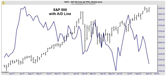
This is a bearish divergence because the price index is reaching new highs while the breadth indicator is not. This tells analysts that many stocks are not participating in the up trend. That is a potential warning that the price trend is likely to reverse.
History tells us that the reversal in the price trend could take time to develop. The next chart shows the A/D Line and the S&P 500 in 1999, the time period leading to the 2000 top.
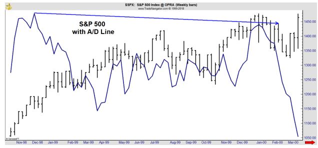
As the price index reached new highs, the A/D Line was failing to reach new highs. This demonstrated that the market indexes were being driven by fewer and fewer stocks. At that time, it was internet stocks that drove the indexes.
Now, there are concerns that the majority of the price gains in the indexes are being driven by just a few stocks. Those stocks are the FAANG group, Facebook, Amazon, Apple, Netflix and Alphabet, the parent company of Google.
Monitoring the Market Breadth
As concerns of the influence of the FAANG stocks grow, it could be important for investors to monitor market breadth. One simple way to do this is with the A/D Line. However, that could require monitoring the trend and could be subjective.
An objective breadth is the percentage of stocks in the S&P 500 index that are above their 200 day moving average (MA). The 200 day MA is used to determine the long term trend. When prices are above that MA, they are in an up trend.
The indicator, which uses the symbol $SPXA200R at StockCharts.com, is considered to be bullish when it is above 50% and bearish below that level. The chart of that indicator is below.
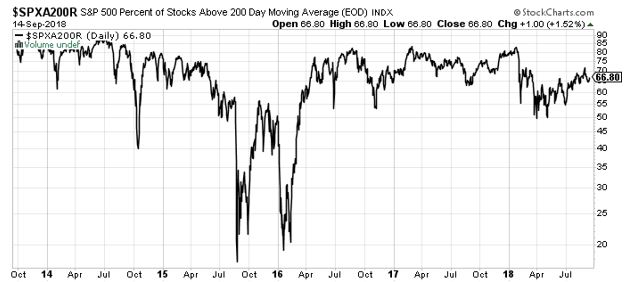
Source: Stockcharts.com
The chart above shows that there has been a deterioration of this indicator even as prices of the major indexes are reaching new all time highs. This is just a warning and the warning can be in place for an extended period of time before the indexes follow the trend.
However, the warning is important to consider. Prices of major market indexes can not continue moving up without most stocks following the trend up. History has shown that is almost always the path of the market action.
Breadth indicates that investors should be concerned. This concern can be put into action by reducing exposure to stocks or by adding put options to the portfolio. Puts increase in value when prices fall and breadth indicates that now could be an ideal time to add put options to potentially benefit from market weakness.