Analyzing Bitcoin in Real Time

Bitcoin and other cryptocurrencies are perfect for technical analysis. They are much like commodities markets where fundamentals play a smaller role than they do in stocks. In the stock market, earnings and cash flow are widely studied. That’s not true in other markets.
Commodity market fundamentals are relatively arcane and specialized. Because of that, much of the trading in these markets is based purely on technical analysis. Funds and commodity trading advisers (CTAs) control billions of dollars and some never consider fundamentals.
The same is largely true in the new crypto markets. There are fundamentals to consider. The fundamentals, as they do in all markets, consist of factors related to supply and demand. For cryptos the supply is often detailed in white papers that detail the rewards of mining and costs of use.
But, the white papers are highly technical. And, in the end, traders make buy and sell decisions based on price because that it is what they all understand. Because fundamentals represent just a small factor in the investment process, technical analysis is well suited to analyzing cryptos.
Starting With a Chart
Most technical analysts begin their review of a market with a look at the chart. There are multiple time frames and multiple formats that could be used. To begin with, we will assume that the trader is focusing on short term profits.
Short term traders will generally make decisions based on the intraday or the daily chart. The daily chart is probably the most practical choice for the individual trader who is often at work and unable to completely follow intraday market action.
To determine whether the daily chart is on a buy or sell signal, it can be useful to take a step back and look at the chart of a higher time frame. This would be a weekly chart since the trader is looking at buying and selling based on daily charts. The weekly chart is shown below.
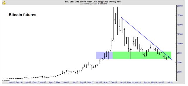
The chart includes a trend line. Drawing trend lines is generally a subjective exercise and there will always be multiple ways to do so. The important point in this chart is simply that the trend on the weekly chart is down.
However, the pace of the decline appears to be slowing. The bubble and the crash are clearly visible on the weekly chart. Generally, after a bubble, prices will fall to the level where the bubble began.
Determining precisely where a bubble began is also a subjective process which means that some degree of judgement will be required. The blue rectangle in the chart is a plausible point that could be cited as the starting point of the bubble. The green rectangle is an extension of that price zone.
Prices have fallen into the green rectangle on three occasions. The previous two prompted nearly immediate rebounds. Prices on the weekly chart are now at the lower end of that rectangle and a rebound appears to be likely.
This price level is also an obvious support level. The blue rectangle shows resistance at that level prior to the bubble forming and resistance is expected to become support after it is broken.
This all indicates, based on the weekly chart, that there is little down side risk in buying at that point. The trade is not risk free, but the weekly chart shows that a bottom is likely. It needs to be confirmed by the daily chart and by momentum.
Drilling Down On the Chart
With a bullish bias in the long term, based on the weekly chart, we now turn our attention to the daily chart which is shown next.
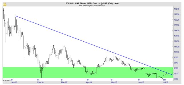
Here, it is possible to see more detail. We see that the first test of support in February was abrupt. There is a spike low and a sharp reversal. This indicates that buyers appear to be looking for a buying opportunity at that time.
In April, when prices returned to the rectangle, buyers were more aggressive, and prices failed to reach the bottom of the rectangle. In this latest instance, the sellers were more aggressive, and a gap formed near the beginning of the rectangle.
This price action indicates that our analysis seems to be a consensus view with many traders following the market action seeing the same obvious patterns on the chart that we identified. The brief dip below the lower line indicates buyers are again the more aggressive traders in the market.
The daily chart confirms that this appears to be an area of support and buying should carry little risk at this level.
Checking Momentum
Finally, we want to check momentum. This should be done with the daily chart and in the chart below, we have added MACD to the same chart that was shown above.
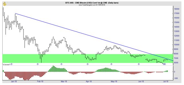
Any popular momentum indicator could be used because they all tend to offer similar signals and the timing of the signals is usually within a few days of each other. In this case, MACD is turning bullish, shown as a cross above the zero line in the chart. The indicator is also rising, indicating we are likely at the beginning of a trend.
Overall, this tells us that bitcoin could be attractive to traders at this level. On a rally, bitcoin could move quickly to the upper end of the green rectangle which is the first resistance level. That offers a potential gain of about 15%.
The next resistance level after that is near $10,000. That is a level visible on the chart and it is likely to be a strong psychological test of the currency. A break above $10,000 could be followed by a sharp rally. Buying now provides the ability to endure some testing of that level, since traders would have a gain of more than 30% at that price.
Given the potential up side, the trade could be attractive to aggressive traders. A stop loss could be used to manage risk. Traders could simply sell on a reversal of the MACD. Or, since the initial target is for a gain of 15%, traders could risk half that amount, placing a stop about 8% below their entry.
Technicals say now is an excellent time to buy bitcoin, perhaps the lowest risk entry point since the bubble popped in December.
For other market related tips and products, Click Here.