The Yield Curve Inversion Could Mean It’s Time to Panic
The yield curve can be a concept that is a challenge to understand for some investors. It might be best to start by defining the yield curve.
If someone asks, “what’s the interest rate?” that question doesn’t mean very much. At any given time, there are rates for car loans, mortgages, savings account and a variety of other uses. There are also different rates within each use depending on the amount of time the rate covers.
The safety of the loan is another factor that is important in determining the interest rate.
For example, think of a car loan. There are often different rates for new cars or used cars. There are different rates for new cars for consumers with different credit scores. There are also different rates for 3 year loans than 5 year loans. There are other factors but that is enough to detail the yield curve.
Let’s limit the problem to rates for a new car with consumers having credit scores between 700 and 725. These consumers will be offered loans for 1 years, 2 years and 3 years. We can plot the interest rates on the vertical axis of a chart and the length of a loan on the horizontal axis. That’s a yield curve.
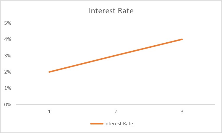
In this example, the chart shows the yield curve. Notice that it slopes higher as we increase the length of the loan period. That’s a normal yield curve because risks increase with the length of the loan and lenders will demand higher interest rates to compensate them for those risks.
Investors usually follow the yield curve for Treasuries. These are securities that are issued for periods as short as one month to as long as 30 years. Issued by the US government, Treasury securities are assumed to be free form default risk.
The Shape of the Curve Is an Indicator
The current yield curve is shown in the chart below.
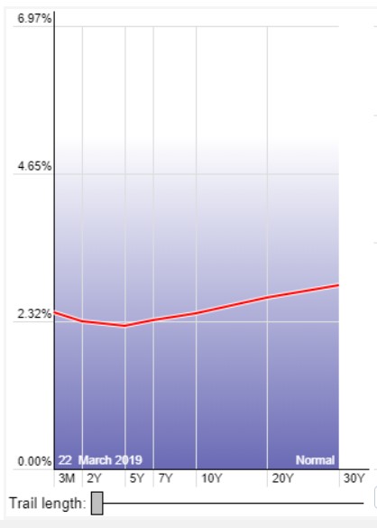
Source: StockCharts.com
Right now, an inverted yield curve can be seen. This is a yield curve where the shorter term yields are higher than the longer term yields, which can be a sign of upcoming recession.
Economists, in addition to stock market analysts have studied the yield curve. In particular, economists at the Cleveland Branch of the Federal Reserve have reviewed the usefulness of the curve as an economic forecasting tool. They note:
“The slope of the yield curve—the difference between the yields on short and long term maturity bonds—has achieved some notoriety as a simple forecaster of economic growth.
The rule of thumb is that an inverted yield curve (short rates above long rates) indicates a recession in about a year, and yield curve inversions have preceded each of the last seven recessions (as defined by the NBER).
One of the recessions predicted by the yield curve was the most recent one. The yield curve inverted in August 2006, a bit more than a year before the current recession started in December 2007. There have been two notable false positives: an inversion in late 1966 and a very flat curve in late 1998.
More generally, a flat curve indicates weak growth and, conversely, a steep curve indicates strong growth. One measure of slope, the spread between ten year Treasury bonds and three month Treasury bills, bears out this relation, particularly when real GDP growth is lagged a year to line up growth with the spread that predicts it.”
The chart below summarizes this relationship.
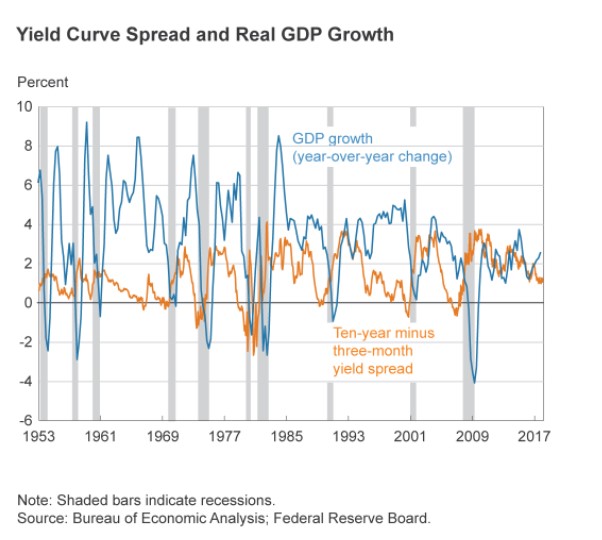
Source: Federal Reserve
What This Means for the Stock Market
Economists have found that the shape of the curve is important. This is logical. When the economy is growing, demand for money should increase. This will push interest rates up. We expect rates on a 10 year loan, for example, to be higher than the rate of a 30 day loan. That relationship is the curve.
As demand for money decreases, potential borrowers are signaling that they have fewer investment opportunities. Lower demand leads to a decline in interest rates. The longer term loans should see the greatest decrease in demand and the curve should flatten, or even invert.
To convert this idea into a useful indicator, we could simply subtract the value of short term rates from the value of long term rates. This results in the next chart which subtracts the interest rate on 2 year Treasuries from the interest rate in notes with 10 years to maturity.
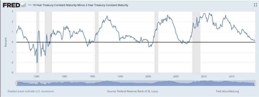
Source: Federal Reserve
The chart shows that the curve inverted before the 2000 and the 2008 bear markets. The down trend in the curve reflects the slowing economic growth that has characterized the current economic expansion.
In the chart, we can see that the trend in the yield curve is down but we also see that the current level of the difference between long and short term rates is not yet inverted. The inversion exists between 2 year and 5 year maturities.
What to Watch For
Of course, the yield curve will change over if it does invert, that’s a signal to expect a recession. But, for now, different curves are telling different stories.
As Barron’s recently noted, there is currently an inversion between 3 month Treasury bills and the ten year Treasury note. There are other inversions along the 30 year spectrum of the Treasury yield curve.
“Experts are split on which yield curve is the most reliable, but the Fed prefers looking at the curve between the 10-year and three-month Treasuries, which on Friday turned negative, to minus 0.196 percentage points.
While a yield curve inversion has preceded recent recessions, it doesn’t happen immediately, and the lead time has been very inconsistent. Historically, a recession can come anywhere from one to two years after the curve flips upside-down, and the stock market usually continues to gain from the day of the inversion until its cycle peak.
So we’ve got more time to watch.”
That’s all that investors can do for now but it is important that they watch.