This Could Be the Best Way to Use Stock Charts
Stock charts show the price action. They simply record the history of trading and tell us nothing about the fundamentals or the financial performance of the company. Proponents of chart analysis sometimes argue the chart does incorporate the fundamental data.
They argue that the current market price reflects all of the information about the company. This is consistent with the Efficient Market Hypothesis (EMH), an academic theory that seeks to explain how stocks are priced in the market.
The theory does make some sense. When investors make a decision to buy or sell, they are acting on the information they have gathered. The current price reflects the collective decisions of millions of traders. Even a decision not to trade affects the price of a stock since that decreases the demand for the stock.
The chart presents the history of all of those individual decisions. In this way it is the running total of the collective decisions of the millions of traders. This is shown at a high level on the chart below.
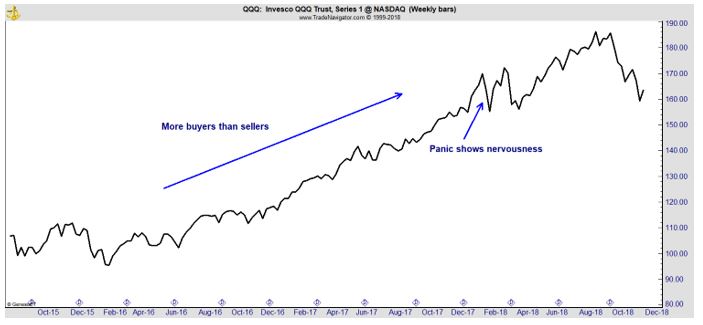
The Chart Shows Urgency of Buyers or Sellers
We know there are more buyers than sellers when prices are rising. Technically, that is not a true statement. It is more of a way to think about the market action.
Technically, each buy order must be offset by a sell order. In other words when someone enters an order to buy 75 shares of a stock, there must be an order from some other investor to sell 75 shares of that stock.
This will be true sometimes but often, market makers jump in to fill open orders.
What is a ‘Market Maker’
A market maker is a market participant or member firm of an exchange that also buys and sells securities at prices it displays in an exchange’s trading system for its own account which are called principal trades and for customer accounts which are called agency trades.
Using these systems, a market maker can enter and adjust quotes to buy or sell, enter, and execute orders, and clear those orders. Market makers exist under rules created by stock exchanges approved by a securities regulator.
In the U.S., the Securities and Exchange Commission is the main regulator of the exchanges. Market maker rights and responsibilities vary by exchange, and the market within an exchange such as equities or options.
At times, high frequency trading (HFT) firms will make the market. HFT is a program trading platform that uses powerful computers to transact a large number of orders at fractions of a second. It uses complex algorithms to analyze multiple markets and execute orders based on market conditions.
Typically, the traders with the fastest execution speeds are more profitable than traders with slower execution speeds.
Whether it’s a market maker or an HFT firm, there are firms that facilitate trading and they take the other side of orders to make trading possible. Their goal is a small profit on the trade for providing liquidity rather than taking a position designed to benefit from a price move.
Because some volume will be associated with these activities, the urgency of buyers or sellers will determine the direction of the trend. When sellers want out of positions more urgently than buyers want in to positions, they will push prices down. And, the opposite factors push prices up.
The Value of Charts
As shown in the chart above, the emotions of traders are shown in the price history. The next chart is of the SPDR S&P 500 ETF (NYSE: SPY). It’s a monthly chart and shows the long term trend.
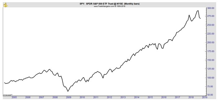
One problem with this chart is that it uses an arithmetic scale. That means the distance between prices is equally spaced. That is the distance from $10 to $20 is equal and the distance between $10 and $110 is ten times greater than that distance from $10 to $20.
This type of scaling minimizes the appearance of decline on long term charts. To avoid that problem, a logarithmic scale should be used when viewing charts of monthly data. This is shown in the next chart.
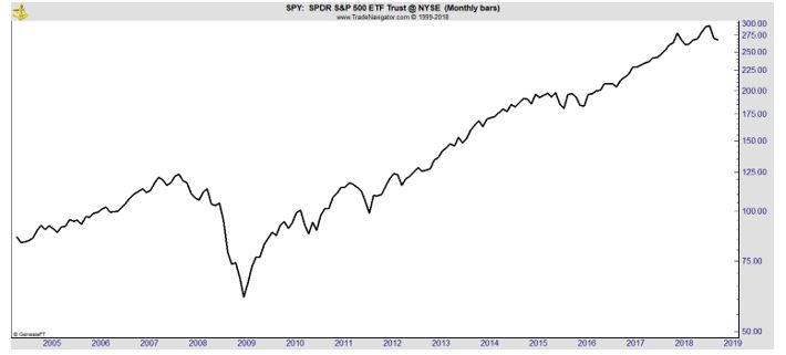
Now, the distance between percentage changes is equalized so the distance from $10 to $20, a 100% change, is the same as the distance between $20 and $40 or $50 and $100. With this view, the bear market of 2008 looks as devastating as it was.
While the scaling can be difficult to understand, it is important to consider. The log scale shows that price declines since the bear market ended in March 2009 have been shallow. The panicky selling of the past few months is still visible and should not be ignored.
When looking at a chart, it is important to remember that when buyers are acting with urgency, prices rise. When sellers are acting with greater urgency, prices fall. And, when the sellers and buyers are about equally motivated prices move sideways.
That’s where we seem to be now from a long term perspective. The chart above shows how selling gave way to buying pressure in 2009. Since then, there have been few down moves. The decline in 2011 is instructive to consider.
At that time, it appeared stocks were falling. But, then prices reached a new high. The new high was bullish. That could be the signal to watch for now. Until prices reach new highs, the chart shows buyers are not acting with a sense of urgency.
If prices drop much more, falling perhaps 15% to 20% below their all time highs, a selling panic could develop. Investors often sell when they lose 20% and that threshold is within reach on the charts. That could send price much lower and down moves do tend to be quick, and steep,
When looking at charts, it could be best to take a long term perspective and to use a log scale to put the price action into perspective. Unfortunately, right now, that view is not what many investors want to see. It is time for caution in the markets.