Stock Picks

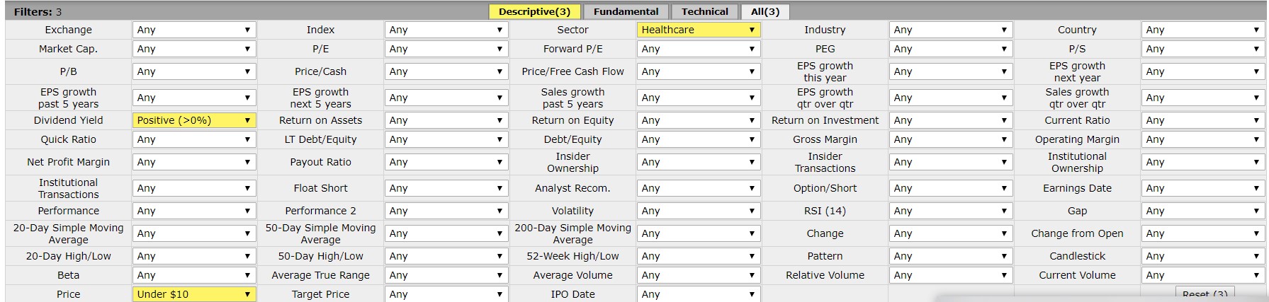
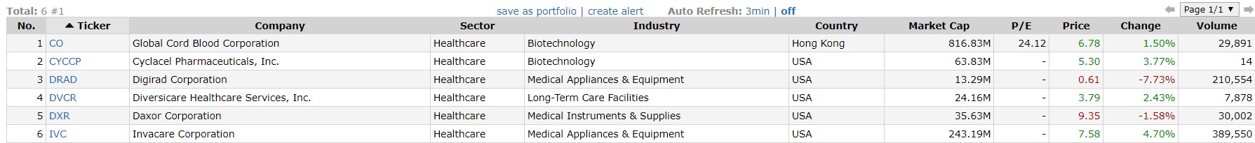
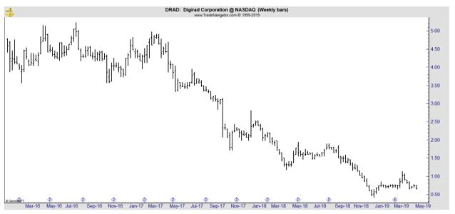
These Could Be the Best Recession Stocks

As the last recession, and bear market, was accelerating, a research report identified the stocks that had performed the best in downturns. The study appeared in Forbes in December 2008 which was months before the end of the bear market in March 2009.

That provides an important opportunity to review how the study held up in real time. Before doing that, we can consider the results of the study:

“We scanned Forbes’ list of the Best Big Companies in America to see which ones held up best this year and during the last recession in 2001.

We required these stocks to have a positive price change over the two most recent economic downturns–Jan. 1, 2008, to Nov. 28, 2008, and March 1 through Nov. 1 of 2001.

Our list shows a few common theories hold true. One such concept is that people will still need basic goods, such as food or consumer products, even in tough times.

Church & Dwight Co. is a perfect example. The Princeton, N.J., company, which dates back to 1846, makes a variety of cleaning products and personal care items under its Arm & Hammer brand.

General Mills and Ralcorp Holdings , which both process breakfast cereal and other food items, also show share price gains during the past two recessions.

Another common belief is that with fewer dollars to spend, shoppers will seek bargains. Family Dollar Stores, Ross Stores and Wal-Mart Stores all fit this mold.

Buying items in bulk is another way to save in tighter times, an area in which BJ’s Wholesale Club specializes.

One theory that has not held up, especially in 2008, is that financial services are a safe place to invest during a downturn. We have only identified one Platinum 400 bank, Hudson City Bancorp that met our screening criteria.”

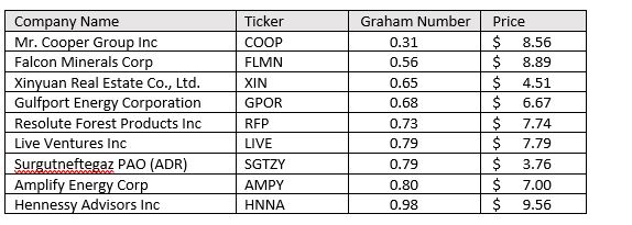
The companies identified are shown in the table below.
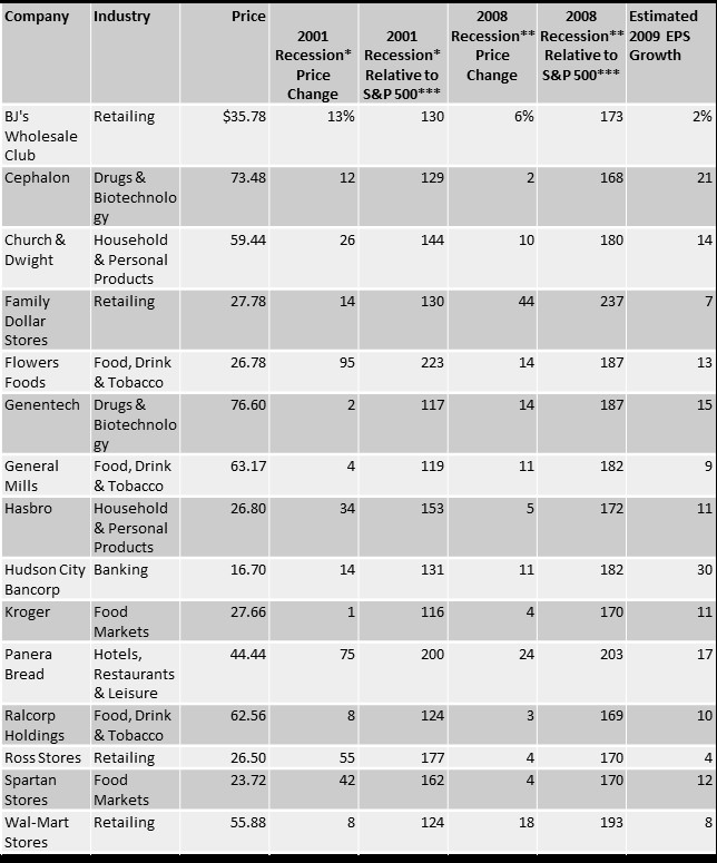
stock picks

Source: Forbes

Prices as of Nov. 30, 2008.

*March 1, 2001, through Nov. 1, 2001.

**Jan. 1, 2008, through Nov. 30, 2008.

***The ending value of $100 invested in the stock, divided by the ending value of $1 invested in the S&P 500.

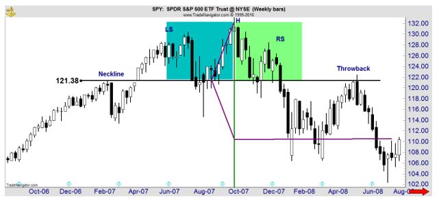
Based on the cutoff date of the study, it is possible to see how the stocks fared in the bear market that laid ahead of them at the time the study was published. The S&P 500 was, in hindsight, far from a bottom with the recovery more than three months away. Stocks would fall more than 20% after this study was published.

It is not possible to recreate all the history because of limitations of data. Not all companies are still traded.

BJ’s Wholesale Club Holdings, Inc. (NYSE: BJ) was taken private after the recession ended and is now trading again, since last September. The break in trading history limits the ability for analysis of how the stock held up in 2009.

Cephalon was acquired by Teva, and again is not available for analysis. Family Dollar Stores was subsequently acquired by Dollar Tree.

Other stocks on the list that were acquired include Genentech, Hudson City Bancorp, Panera and Ralcorp.

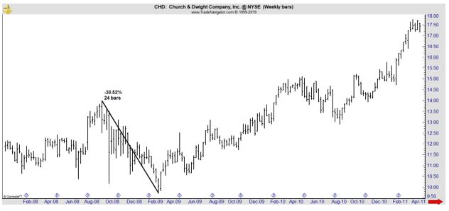
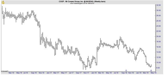
Church & Dwight Company (NYSE: CHD) lost a little more than 30% in the 2008 – 2009 selloff, significantly less than the S&P 500 Index which lost about 55% over that time.

CHD weekly chart

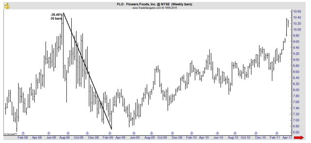
Flowers Foods, Inc. (NYSE: FLO) also lost less than the S&P 500 but still suffered a significant loss.

FLO weekly chart

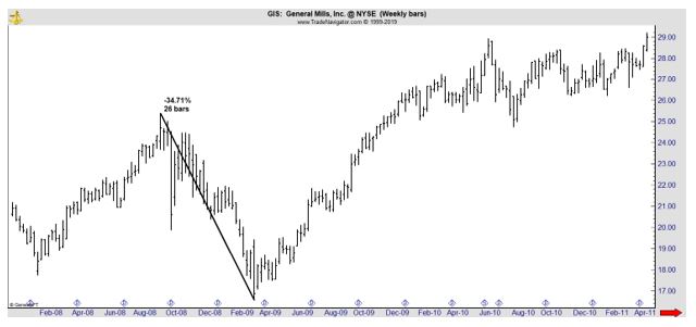
General Mills, Inc. (NYSE: GIS) is shown next.

GIS weekly chart

Hasbro, Inc. (Nasdaq: HAS), Ross Stores, Inc. (Nasdaq: ROST), The Kroger Co. (NYSE: KR) and Walmart (NYSE: WMT) all loss less than the S&P 500 with WMT faring the best, losing just about 27%.

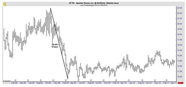
Spartan Stores is now known as SpartanNash (Nasdaq: SPTN). The stock lost more than S&P 500 during the bear market.

SPTN weeklyThis brief look at the data shows the problem with trying to profit in a recession and a bear market. History shows that the average bear market decline associated with a recession is about 35% and most of the stocks trading in 2008 and 2009 lost at least that much.

An interesting conclusion from the study of the winners in the 2001 recession is that no two recessions are alike. Stocks that showed gains in the bear market that began in 2000 failed to do so in the next recession.

Investors are often reminded that past performance is not a guarantee of future performance and this means no investment manager is guaranteed to deliver results in the future that mirror the results of the past. That fact does seem to be well understood.

But stocks are also unlikely to perform the same in the future as they did in the past. The winners in the last recession, or in the recession before the last recession, may not be the winners in the next recession.

That actually makes sense since not all recessions are alike. In 2000, the recession followed a bubble in internet stocks and technology stocks were among the worst performers in that bear market. But that recession was relatively mild and the recovery began in a fairly normal manner.

Efforts to jump start the recovery after the next recession were anything but normal. Interest rates were cut to 5,000 year lows, not just in the United States but in major economies around the world. That recession was preceded by a financial crisis, with the home mortgage market being a central focus of the financial damage.

The differences in those two recession and recoveries make it obvious that the next recession and recovery will be different. It is extremely unlikely subprime mortgages will create a global credit crisis in the future. Regulators around the world have taken steps to guard against that.

Yet, there is a future crisis that regulators have failed to foresee. That is not a fault of the regulators who are doing all they can. It is simply the nature of a crisis. It must be unforeseen or else prudent regulators, business executives and investors would avoid the problem.

Stock market strategies

How to Really Read Chart Patterns

Charts have been used by traders for hundreds of years. The practice was widespread by the early 1900s when many of the patterns traders spotted in charts had been given names, much like ancient civilizations had given names to clusters of stars they believed looked like lions and archers.

In 1930, Forbes magazine editor Richard Schabacker published the Stock Market Theory and Practice, the first book cataloguing chart patterns. From there, an explosion of interest in patterns developed.

In 1948, Robert Edwards and John Magee published Technical Analysis of Stock Trends, a book still considered to be the authoritative reference of chart patterns. There really hasn’t been anything new written about patterns in almost 60 years and the old rules laid out by 1948 are still widely followed.

One example will show how Edwards and Magee described patterns. They wrote that a head and shoulders consists of three peaks in price occurring at the end of the uptrend, with the center peak being higher than the other two.

The two “side” peaks should be about equal in height. The three peaks give the pattern its name, with the center being the head and the right and left shoulder forming on either side of the head. Connecting the bottom of the peaks gives us the neckline.

When prices break below the support level drawn as the neckline, we have a sell signal because that indicates the uptrend is reversing. A picture is easily worth 1,000 words here, so the chart below shows the pattern. It’s a chart of the top that preceded the 2008 bear market.

SPY weekly chart

This is a chart of SPDR S&P 500 ETF (NYSE: SPY) in 2007. The head of the head (H in the chart) marked the exact high in the stock market. The shoulders are not perfect but no pattern will ever unfold perfectly. The left shoulder (LS) is part of the uptrend followed by a normal pullback.

The uptrend resumes after the pullback and the move to a new high results in the formation of the head. We then see another pullback before a rally that fails to set a new high which is the right shoulder (RS). A break of the neckline indicates the trend is over but we often see a “throwback” or a rally that fails before reaching the high of the right shoulder.

The key element of any pattern could be a degree of symmetry. For this idea, the picture below is worth a few thousand words.

SPY weekly chart

The blue and green rectangles highlight market action that is slightly similar, at least from a subjective perspective. In the rectangles we see two pullbacks that moved below the neckline briefly. The two rectangles are the same size, showing the price action took a similar amount of time to unfold.

The symmetries here are very rough but the purple line shows a high degree of symmetry. The lines drawn at angles from the neckline are the same length showing the distance from the neckline is roughly equal to the initial decline in price after the neckline was broken.

This symmetry is consistent in all patterns and is the most important point of any pattern you spot. The height of the pattern provides a tool to find price targets.

Another characteristic of a pattern is the existence of support or resistance. In the head and shoulders we saw support at the neckline. All patterns are simply defined as price action bounded by two lines and these lines could also be called support or resistance.

This is true for a falling wedge, a rectangle, a cup with handle, a triangle or any other pattern. No matter what the pattern is, the distance between those two lines is the important point of the pattern. We should expect prices to move at least that distance when the price breaks out of the pattern.

 Here’s another example, using a recent chart of iShares MSCI United Kingdom ETF (NYSE: EWU).

EWU weekly chart

Because chart patterns are subjective, the name of the pattern will not be important. We could call the highlighted area a double top. What is important is that the pattern is about $4 high. That’s found by subtracting the top from the bottom.

This doesn’t need to be precise. Patterns are imprecise and should be used as guidelines so being off by a few cents won’t affect your analysis.

To find a target, after prices break out of the pattern, subtract the height of the pattern ($4) from the bottom of the pattern. That’s shown in the chart and the decline stopped at the target. This gave a clear buy signal.

While patterns are usually found with a visual approach, patterns can also be identified in objective terms, as I mentioned earlier.

MIT professor Andrew Lo defined a head and shoulders chart pattern as price action where “the magnitudes and decay pattern of the first twelve autocorrelations and the statistical significance of the Box-Pierce Q-statistic suggest the presence of a high-frequency predictable component in stock returns.” 

The important part of his definition is simply that the pattern can be described in terms that can be programmed. This makes it testable.

In Foundations of Technical Analysis: Computational Algorithms, Statistical Inference, and Empirical Implementation, working with Harry Mamaysky and Jiang Wang, Lo found that the head and shoulders pattern, when combined with several other indicators does “provide incremental information and may have some practical value.”

This is not high praise but it does indicate there is no need to ignore patterns. Other researchers have reached similar conclusions when testing a variety of patterns. In general, they find patterns work sometimes and can be useful as part of a trading strategy.

This leads to our conclusion which is that charts could be one input in an analysis. It’s best to look for an area on the chart where support and resistance is obvious. Then identify a price target and trade when the breakout occurs.

Don’t worry about what the chart pattern is called since all price objectives are found with the same technique. The true value of charts is that they are one of the few tools that allows traders to quickly develop price targets and that can allow for trading with increased confidence.

Stock market strategies

Can This Trick Really Help Your Portfolio?

It’s often described as the “only free lunch in investing.” Diversification is defined as “a risk management strategy that mixes a wide variety of investments within a portfolio.

The rationale behind this technique is that a portfolio constructed of different kinds of assets will, on average, yield higher long-term returns and lower the risk of any individual holding or security.

Diversification strives to smooth out unsystematic risk events in a portfolio, so the positive performance of some investments neutralizes the negative performance of others. The benefits of diversification hold only if the securities in the portfolio are not perfectly correlated—that is, they respond differently, often in opposing ways, to market influences.

Studies and mathematical models have shown that maintaining a well-diversified portfolio of 25 to 30 stocks yields the most cost-effective level of risk reduction. The investing in more securities generates further diversification benefits, albeit at a drastically smaller rate.”

Rather than relying on general rules of thumb like buying 25 to 30 stocks, the American Association of Individual Investors studied the question of diversification. This is an older study but covers the question well.

The study began with “an analytical assessment of investment risk” which “begins by breaking total uncertainty into two components: the general risk of variations in the market return and the specific risk of variation in individual stock returns. 

Figure 1 indicates the magnitude of this second component of risk by showing the tremendous variation in the rates of return of the 1,528 stocks listed on the New York Stock Exchange during 1988. The horizontal axis shows the rate of return consisting of dividends and capital gains, and the vertical axis reports the percentage of stocks that achieved those returns.

distribution of NYSE stock returns
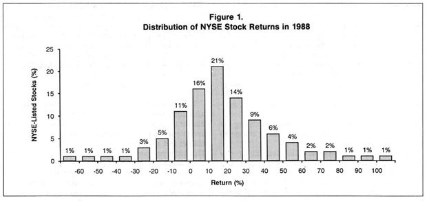
The graph indicates that 21% of all stocks produced returns that ranged between 10% and 20%. A 51% majority of stocks had returns between 0% and 30%. For the 1,528 stocks listed on the New York Stock Exchange for the entire year, the average return was 19%.

There is nothing that investors can do about general market uncertainty. Individual investors simply have to accept the risk associated with swings in the market if they are investing in the stock market and desire the returns related to this risk.

The specific risk of choosing particular stocks, on the other hand, can be reduced with diversification. Spreading an investment over many stocks reduces the chances of a return substantially below the market average. The probability of all the stocks doing poorly is small, and the negative effects of a few bad choices are diluted within the large portfolio.

The practical problem is simply determining how many stocks are necessary in order to achieve the benefits of diversification. The conventional wisdom based on a number of analytical studies is that investing in only 15 to 20 stocks provides the benefits of diversification.

This advice reinforces the “law of small numbers” intuition that a small sample of stocks will accurately reflect the overall result of the stock market. In fact, investing in 15 to 20 stocks does not nearly exhaust the risk-reducing advantages of diversification.

Many investors will choose to invest in far more than 20 securities in order to reduce risk to an acceptable level.

The information in Figure 2 allows an investor to make an informed choice about the appropriate level of diversification and risk.

This graph shows the returns for all possible portfolios drawn from the 1,528 securities listed on the Big Board. The horizontal axis indicates the number of stocks in the portfolio, and the vertical axis shows the percentage of these portfolios with a return substantially below the market.

reducing risk

How Do You Interpret These Results? 

Figure 2 demonstrates that 10% of all portfolios consisting of 20 stocks had returns that were below the market average by 10% or more. Moreover, 26% of these 20-stock portfolios were under the market by 5% or more and 40% by 2% or more.

Clearly, there is a substantial amount of risk that can be avoided by diversifying beyond 20 stocks. An investor willing to accept only a 10% chance of missing the market by 5% or more needs to diversify across 80 stocks.

Put another way, the closer an investor wants to get to the market rate of return, the more diversification is necessary: An investor willing to accept a 30% chance of missing the market by 5% or more can diversify among only 18 stocks, but if the investor wants a 30% chance of missing the market by only 2%, he must diversify among at least 90 stocks.

Figure 2 shows that, compared to investing in only one stock, diversifying across 20 stocks produces a substantial reduction in risk: The chance of a return 5% below the market falls from 47% to 26%.

However, adding 20 more stocks (for a total of 40 stocks) to the portfolio only reduces the risk from 26% to 18%. The fact that reductions in risk are increasingly difficult to achieve is the source of the conventional wisdom that 20 stocks adequately provide the benefits of diversification.

Some analysts see the slow reduction of risk apparent in the graph and conclude that diversification beyond a small number of securities is not worthwhile.

A far better conclusion is that the slow rate necessitates diversification across a large number of stocks in order to eliminate the substantial amount of specific risk. 

Figure 2 demonstrates that the law of small numbers is not valid; in fact, investing in a large number of stocks is necessary to approximate the performance of the market with some reasonable degree of confidence.”

But, is this practical for an individual investor? Is it really possible to invest in 80 or more individual stocks and understand the companies while having time to monitor the progress of each stock? Even with portfolio management tools, that could be a daunting task.

However, if the goal is to match the market diversification is needed. But the great investor Warren Buffett famously stated that “diversification is protection against ignorance. It makes little sense if you know what you are doing.”

If your goal is to beat the market, risk may need to be accepted and diversification may not be the best course of action.

Stock Picks

Cheap Gold Miners

Gold prices have been in a trading range for some time and could be considered bullish based on the chart. Prices are near the upper end of the range and holding above an important support level that has been in place since late 2017.

Gold weekly chart

Investors value gold for many reasons. Some see the yellow metal as protection against economic collapse. These investors tend to accumulate physical gold as coins or bars believing they will be able to use their gold to prosper under extremely adverse economic or social conditions.

Other investors believe the financial system will continue to function in the future but acknowledge gold tends to rise under adverse conditions and maintain positions in the metal through investment accounts owning ETFs, futures or gold mining stocks.

Some investors simply view gold as a trading vehicle to be bought in up trends and sold in down trends.

Of course, it is possible to directly trade gold. This can be done with coins, ETFs or futures. Coins are collectibles and can have tax consequences that are different than investments in stocks.

Many investors are surprised to learn popular ETFs that back their shares with physical holdings of precious metals face taxes at the higher rate for collectibles. This includes SPDR Gold Shares (NYSE: GLD).

Futures carry their own tax consequences and risks and many individual investors avoid these markets.

Publicly- traded stocks of gold miners offer an indirect way to invest in gold. Mining companies are taxed at the same rate as stocks which is lower than the rate for gains in GLD or other ETFs.

In addition to offering tax benefits, gold miners also offer the benefit of leverage. An example might be the best way to explain the leverage miners offer.

Let’s assume it costs a miner about $800 an ounce to produce gold and they mine 1 million ounces a year. If gold is at $1,000 an ounce, (a number used for simplicity) the company should generate a profit of about $200 an ounce or $200 million

This is a simplified example so we will assume the company has no other costs and no additional revenue. If the price of gold increase by 30%, to $1,300 an ounce, assuming the costs of production stayed the same, the miner’s profits would increase to $500 an ounce or $500 million for the company, an increase of 150%.

The miner is leveraged, in this example, 5 to 1, and benefits immensely from higher gold prices. Even smaller gains in the price of gold have a large impact on earnings. A 1% increase in gold prices (to $1,010 an ounce) results in a 5% jump in the earnings of this hypothetical mining company.

Remember, there is no free lunch in the stock market. Leverage can help increase investment returns on the upside but can cause significant losses on the downside.

A 1% decline in the price of gold could result in a 5% drop in earnings for this gold miner and we would expect the stock price to reflect the diminished earnings potential of the company. A 20% decline in gold would push the miner from a profit to a loss.

This leverage makes gold miners an excellent way to invest in gold. Buying miners when gold prices are low can lead to large gains when the price of the metal recovers.

With gold potentially poised for a breakout, now is the time to look for bargains in the mining sector.

We searched for gold miners using a free screening tool to find stocks offering value and trading under $5.

Many individual investors understand that low priced stocks could be appealing for two reasons. One reason is that the low price means they have little down side risk in dollar terms. The second reason is that low priced stocks are generally the ones that deliver the largest short term gains.

One study looked at how low priced, or cheap, stocks performed relative to more expensive stocks. The study found that cheap stocks delivered more than six times the average return of the more expensive stocks in a typical quarter.

That’s why we limited our search for potential bargains by focusing on stocks priced at less than $5 per share.

Finally, we looked for stocks with a  low price to sales (P/S) ratio, an indicator that the stock offers potential value.

One way to find stocks meeting these requirements is with the free stock screening tool available at FinViz.com. At this site, you could screen for a variety of fundamental factors, high levels of institutional ownership and bullish institutional transactions. An example is shown below.

Finviz screener

Source: FinViz.com

This tool is flexible and could be applied to other industries besides gold mining. Different criteria, both fundamental and technical could also be applied.

Remember, there is no guarantee any stock will increase in value. Also, it is important to remember when we search for stocks using quantitative measures, our goal is to identify stocks that meet those criteria. The screens we develop could be used as the cornerstone of long-term investment strategies but any individual stock in the list could be a winner or loser.

Our search identified nine miners meeting these requirements.

stock picks

Source: FinViz.com

Any of these stocks could be a potential winner and all worth further research. They are cheap enough in price that an investor could consider a diversified investment in gold miners to benefit from higher prices in gold.

They are also cheap in value, at least when value is measured by the P/S ratio. However, there are still risks with any stock and traders could consider stops to protect against large losses. An initial stop is often used to mitigate the risk of the stock not moving in the intended direction.

After a time, if the stock does move higher, investors can consider a trailing stop to potentially preserve profits and offer a disciplined strategy for exiting trades to move assets into other potential investments that could offer greater potential rewards.

Stock market strategies

What You Should Know About the Price to Sales Ratio

Fundamental analysts focus on data available in financial statements. Among the most popular uses of this data is the calculation of the price to earnings (P/E) ratio.

Another metric is the price to sales (P/S) ratio. The formula is similar to the P/E ratio, but it uses sales instead of earnings. To calculate a stock’s P/S ratio, you simply divide its price by its sales per share.

price/sales ratio

This might be a familiar concept, but we sometimes forget that investment analysis is a fairly new field of study and the P/S ratio appears to have been publicly known for a little more than 30 years although it was probably used by some analysts before then.

Investment manager Ken Fisher popularized the P/S ratio in his 1984 book, Super Stocks. Fisher is a value investor who noticed a problem – many small companies have no earnings.

super stocks

Value investors at the time were unable to evaluate companies without earnings using their standard tools yet these companies have the potential to be among the biggest long-term winners in the stock market.

By the time the company reports earnings for several years, the stock may have gained several hundred percent or more. Fisher’s goal was to find super stocks which he defined as stocks capable of increase in value by 200% to 1,000% over three to five years. This meant he couldn’t afford to overlook companies without earnings.

Because super stocks may not have earnings yet, he focused on sales and recommended considering stocks with low P/S ratios, preferably 0.75 or less. Fisher also used other tools, including the price-to-research ratio to identify companies investing heavily in the future. The P/S ratio was a starting point for him rather than a standalone tool.

While Fisher may have introduced the P/S ratio, the indicator’s popularity increased after James O’Shaughnessy published What Works on Wall Street in 1997. This book was one of the first books to provide quantitative test results of a large number of indicators to individual investors.

Using data from 1951 to 1994, O’Shaughnessy tested dozens of indicators. His testing process allowed for an “apples to apples” comparison of different indicators. He would evaluate all stocks based on an indicator at the beginning of the year and form a portfolio of the stocks that had the best value, the lowest P/E ratio or the lowest P/S ratio among others.

He would repeat this process every year and found how the indicators performed over time. He then summarized all of the results in easy to understand tables that gave individual investors a chance to compare the various investment tools side by side.

Through his tests, he determined that the P/S ratio was among the best tools for value investors. His work showed the single best strategy using multiple indicators for stock pickers combined the P/S ratio with relative strength.

Later tests, however, have raised varying levels of doubt about this conclusion. In 2009, Richard Tortoriello’s Quantitative Strategies for Achieving Alpha, found indicators based on cash flow were the best performers. His tests used data from 1987 through 2006, a twenty-year period.

Alpha

Tortoriello followed a process that was similar to O’Shaughnessy’s but used more indicators and focused on tools professional investment managers used.

The test dates used by each author show one of the problems with the P/S ratio tests. O’Shaughnessy’s tests ended with data in 1994. The tech bubble unfolded after that. At that time, a number of internet companies began reporting strong sales growth.

Some of these companies had high sales and low P/S ratio because the sales were inflated by accounting techniques. Under generally accepted accounting principles at the time, a company could sign an agreement with another company to place ads on each other’s web sites.

The ads would be recorded as revenue by each company but no cash changed hands. These in-kind transactions made many companies look like they had sales at the time but the sales were an illusion, based on contracts that were allowed under accounting rules.

This example demonstrates that sales don’t provide enough information about the company’s financials to make an investment decision. Profits and cash flow are also important.

Looking beyond the problems with recording sales, at first glance the test period O’Shaughnessy used seems better than Tortoriello’s because it is longer. But accounting rules change and using longer test periods can mix apples and oranges.

This is a challenge to researchers. It’s important to use a lot of data but not too much. Twenty years is a good time frame because accounting rules change slowly with new rules being phased in over three to five years after being developed over a timeframe spanning several years.

However, when using more complex indicators that incorporate several variables, it can be better to use longer test periods. Test setup is a complex subject that researchers face at the start of their projects.

These problems explain why the P/S ratio may not be the single best indicator to use. In fact, no single indicator will ever be the best all of the time. But the P/S ratio is still valuable when used properly. Like several other fundamental metrics, the P/S ratio is best used in context.

P/S ratios vary greatly from industry to industry. The means the metric can be used to sort within an industry or sector. If you were looking for a utility stock, for example, you could sort the sector by P/S ratio and consider buying the stocks with the lowest P/S ratio.

Another way to use the ratio is to compare the current ratio to the 5-year or 7-year average for the company, the sector or industry. This helps to show whether the company is potentially undervalued right now. Additional research should then be conducted but stocks trading with P/S ratios below their long-term average are potentially undervalued.

In conclusion, it seems fair to say the P/S ratio can provide important information, but it should always be used with other indicators.

Stock market strategies

Stocks Under $10 Ben Graham’s Formula Says Are Buys

Warren Buffett completed his graduate degree at the Colombia Business School which he specifically chose so he could study under Ben Graham.

Graham wrote the original textbook on investment selection with David Dodd. That book, Security Analysis, is still considered to be required reading by many market analysts. Graham also wrote The Intelligent Investor, a more accessible book designed for individual investors.

Graham believed that a company’s financial statement held the key to success. He advocated looking at the income statement and balance sheet to find stocks that offered value.

The Graham Number

In particular, Graham looked for stocks with a low price to earnings (P/E) ratio and a low price to book (P/B) value. He also explained a technique to combine these two metrics into a single number, the Graham Number.

The Graham Number is a geometric average of the P/E ratio and P/B ratio.  The geometric average of two numbers is the square root of the product of the two numbers. Graham advised investors to look for value and defined value as a P/E ratio of less than 15 and a P/B ratio of less than 1.5.

The Graham Number combines those two values into a single data point. It is thus the square root of 22.5 times the P/E ratio times the P/B ratio. When divided by the current market price, ratios below 1.0 indicate value.

Now, we know from news stories Buffett recently told CNBC that “one of the fellows in the office that manage money … bought some Amazon (Nasdaq: AMZN) so it will show up in the 13F” later this month.

Buffett was referring to either Todd Combs or Ted Weschler, who each manage portfolios of more than $13 billion in equities for Berkshire.

Buffett has long been a fan of Amazon and its CEO, Jeff Bezos, praising the company’s dominance and the founder’s business prowess. But while Buffett has sung the company’s praises, he’s never bought Amazon shares.

So a headline that Berkshire was buying shares likely would spark interest in the markets.

“Yeah, I’ve been a fan, and I’ve been an idiot for not buying” Amazon shares, Buffett said. “But I want you to know it’s no personality changes taking place.”

The stock had a P/E ratio of almost 100 and a P/B ratio of almost 20 yet the Graham Number is just 0.11 so it could be an interesting value stock.

Of course, one example does not prove the value of the Graham Number, but it provides some degree of confidence in the technique.

The Graham Number could be used to screen for stocks that offer value, and it could be hidden value as in the case of Amazon.

Now, it is important to remember that there is no guarantee any stock will increase in value. Also, it is important to remember when we search for stocks using quantitative measures, our goal is to identify stocks that meet those criteria.

Just because a stock has a low Graham Number, it does not mean the price will rise and any individual trade based on that idea could be a winner or loser.

We recently screened for cheap stocks with Graham Numbers below 1.

We limited our search to low priced stocks.

Individual investors understand that low priced stocks could be appealing for two reasons. One reason is that the low price means they have little down side risk in dollar terms. The second reason is that low priced stocks are generally the ones that deliver the largest short term gains.

One study looked at how low priced, or cheap, stocks performed relative to more expensive stocks. The study found that cheap stocks delivered more than six times the average return of the more expensive stocks in a typical quarter.

That’s why we limited our search for potential bargains by focusing on stocks priced at less than $10 per share. While we would like to see stocks at even lower prices, there just weren’t many that passed our stringent screening criteria, so we had to use a cut off value of $10 to ensure some degree of diversification in this screen.

The stocks that passed this screen are shown below.

cheap stock picks

This list could be used as a starting point for research.

Some of these companies, like Mr. Cooper Group (Nasdaq: COOP), may not be well known.

Mr. Cooper Group provides servicing, origination and transaction-based services related principally to single-family residences throughout the United States. It offers mortgage servicing and a loan originations platform.

The company operates through its subsidiary, Nationstar Mortgage Holdings Inc. it operates through its brands, such as Mr. Cooper, Xome and Champion Mortgage.

The company’s Mr. Cooper brand is a home loan servicers that is focused on providing a variety of servicing and lending products, services and technologies. Xome provides technology and data enhanced solutions to homebuyers, home sellers, real estate agents and mortgage companies. Champion Mortgage is a reverse mortgage servicer.

The stock price does appear to be near support.

COOP weekly chart

Analysts expect earnings per share of $2 in 2019 with increases to more than $2.70 in 2021. With six analysts covering the stock, the lowest estimates are for earnings of $1.45 this year and $1.95 in 2021. Even at the lowest estimates, the stock appears to offer value.

The stock offers liquidity with average trading volume of about 900,000 shares a day and potential value. This could be the kind of stock that warrants additional research and demonstrates the possible value of using the Graham Number to unlock investment ideas.

Stock Picks

Six Stocks Under $5 Designed for the Worst Six Months

We are now officially in the seasonally bearish worst six months, the time of year characterized by the popular saying to “sell in May and go away.” This is the time of year with high risks and potentially lower than average returns.

Losses for the worst six months resulted from negative returns in just a few years. Stocks were actually up 60% of the time in the worst six months, close to the winning percentage of 69.3% for the best six months. Just a few years actually explain all of the performance in both time periods.

For the worst six months, the worst year, 2008, explains why this six-month period shows a loss. Excluding that year, we have an average annual gain of 3.6% in the worst six months.

This leaves us with a problem – even in the worst six months, stocks go up most of the time. Missing the gains means we fail to meet our primary investment goal which is to maximize wealth. If we sit on the sidelines earning nothing on cash for half the year, we are almost certainly not maximizing wealth.

Sam Stovall, a highly respected researcher at Standard & Poor’s, addressed this problem and found that defensive sectors, stocks investors turn to when they are concerned about risk, outperform broad stock market averages during the worst six months.

For specific investments, he advised looking at the consumer staple and healthcare sectors. His research indicated stocks in these sectors could provide market-beating gains even during the worst six months.

This week, we look at health care stocks that provide income and are priced below $10 a share.

Finding Potential Income For the Worst Six Months

We will start our search by focusing only on stocks that offer a dividend and, in effect, pay investors to wait for returns.

Then, we limited our search to low priced stocks.

Individual investors understand that low priced stocks could be appealing for two reasons. One reason is that the low price means they have little down side risk in dollar terms. The second reason is that low priced stocks are generally the ones that deliver the largest short term gains.

One study looked at how low priced, or cheap, stocks performed relative to more expensive stocks. The study found that cheap stocks delivered more than six times the average return of the more expensive stocks in a typical quarter.

That’s why we limited our search for potential bargains by focusing on stocks priced at less than $10 per share. While we would like to see stocks at even lower prices, there just weren’t many that passed our stringent screening criteria, so we had to use a cut off value of $10 to ensure some degree of diversification in this screen.

One way to find stocks meeting these requirements is with the free stock screening tool available at FinViz.com. At this site, you could screen for a variety of fundamental factors, high levels of institutional ownership and bullish institutional transactions. An example is shown below.

stock screener

Source: FinViz.com

This screen is a reasonable starting point for additional research. There is no guarantee any of these stocks will deliver gains and risk should always be considered. It’s also important to remember that screens like this will not identify unique risk factors.

Stocks passing the screen are shown below.

stock picks

Source: FinViz.com

You can see these are not household names. But they are interesting companies with potential.

Digirad Corporation (Nasdaq: DRAD), for example, is a provider of diagnostic solutions. The company makes and services diagnostic imaging solutions for medical facilities and physicians’ offices.

Digirad provides equipment for nuclear cardiology, ultrasound, echocardiography, vascular imaging, and neuropathy diagnostics, along with equipment rental and personnel staffing.

Many of the company’s products are relatively portable, making them attractive to providers who avoid the expense of building a room to accommodate large equipment. The designs are also open, making them attractive to patients who often prefer open systems to closed-in designs that can create a feeling of claustrophobia.

healthcare products chart

Recently, Digirad acquired a mobile healthcare services division and the exclusive right to sell and service Philips Medical Equipment in the upper Midwest. The company is now integrating those operations and could grow its business with current operations or through the acquisition of small competitors as it has in the past.

DRAD began paying a dividend in 2013 and management has indicated they intend to continue doing so. However, some data sources indicate the company no longer pays a dividend.

This highlights the importance of research. We reproduced the results of our screen from FinViz in the chart above. You can see that data source indicates this is an income stock. Different data providers will sometimes present conflicting information.

If income is important to you, it could be best to verify the dividend with the company. That can usually be done by reviewing the company’s investor relations web site or by calling the company’s investor relations representatives.

The chart of DRAD is shown below and indicates the stock is in a long term down trend.

DRAD weekly chart

It does appear to be trading near support and the down side risk in the stock is limited to the price paid which is relatively low. If you do find this stock attractive it could be worth considering the stock as a trade, taking profits as they become available. After all, a stock can always be repurchased after it is sold.

The stocks we identified with the FinViz screen could all deliver significant gains, or they could all prove to be worthless. That is the risk of any investment but the potential gains in small cap stocks can be large while the potential risks are limited to the price paid at the time of purchase.

While screening tools can be useful, as we saw, they should always be used as a starting point for research since the data they use could be incorrect. It could be best to verify the data points that are most important in your decision process with at least one other data source.

Stock market strategies

This Company Demonstrates Why You Should Diversify Your Portfolio

Many investors follow Warren Buffett because he may be the most successful value investor of all time. That means they read what Buffett says and try to incorporate his ideas into their own portfolio management.

This can be helpful but could also present some problems. Buffett, for example, has said, “stated that “diversification is protection against ignorance. It makes little sense if you know what you are doing.”

This contradicts much of what can be conventional wisdom about diversification.

Diversification, according to Investopedia “is a risk management strategy that mixes a wide variety of investments within a portfolio.

The rationale behind this technique is that a portfolio constructed of different kinds of assets will, on average, yield higher long-term returns and lower the risk of any individual holding or security.

Diversification strives to smooth out unsystematic risk events in a portfolio, so the positive performance of some investments neutralizes the negative performance of others.

The benefits of diversification hold only if the securities in the portfolio are not perfectly correlated—that is, they respond differently, often in opposing ways, to market influences.

Studies and mathematical models have shown that maintaining a well-diversified portfolio of 25 to 30 stocks yields the most cost-effective level of risk reduction. The investing in more securities generates further diversification benefits, albeit at a drastically smaller rate.”

This contradicts with Buffet’s view, which is in effect saying that studying one or two industries in great depth, learning their ins and outs, and using that knowledge to profit on those industries is more lucrative than spreading a portfolio across a broad array of sectors so that gains from certain sectors offset losses from others.

Risks Might Not Be Easy, or Even Possible, to Fully Understand

Let’s say you become an expert on an industry and believe you understand the risks of the industry. Let’s assume that it’s the utility industry. Zack’s summarizes key risks of the sector:

“Regulatory Risks: Most U.S.-based large-cap utilities are regulated at the state and local levels. With many of these companies operating in multiple states, that means an increased burden on management to ensure the company does not fun afoul of regulatory guidelines.

That is more of concern for the company than for investors. However, if a major utility gets into hot regulatory water in one state,

Wall Street is not likely to care about the fact that the same company operates in 10 other states. When companies draw the ire of regulatory bodies, it is rarely good for the stock, regardless of sector.

Commodities Prices: For decades, more than half of the electric power in the United States was generated with coal. Electric utilities started to drift away from coal in the 21st century as a shale boom made the nation one of the world’s largest natural gas producers.

Then when gas prices collapsed during the 2008 financial crisis, utilities embraced heavier natural gas use because it was cheaper and cleaner. The bad news is that as natural gas prices and demand spike, utilities could be forced to use more coal.

The worse news is that emerging markets could stoke coal demand, driving prices higher. Utility companies could be faced with higher prices at the same time for the two commodities they most depend on.

Growth Stocks in Favor: Utilities they tend to prove durable during market downturns. However, that cuts both ways.

In a legitimate bull market in which investors favor high-beta growth stocks in sectors such as technology, investors holding utilities stocks are likely to see their returns underperform the broader market.

Interest Rate Risk: A high interest rate environment is often viewed as extremely bad news for utilities stocks, for two reasons. Electric utilities are capital-intensive businesses that often carry large debt loads.

When interest rates rise, so does their cost of financing debt. And because those higher debt costs strain some balance sheets, some utilities pare or suspend dividends when interest rates are high.”

These are all risks that can be understood and quantified to some extent in financial models. Analysts could, for example, understand the risk to earnings of interest rates go up or commodity costs spike higher.

Yet, the risk that undermined Pacific Gas & Electric (NYSE: PCG) are not on the list.

PCG weekly chart

Wildfires Claim the Company

PG&E filed for bankruptcy after “Fire investigators determined PG&E to be the cause of at least 17 of 21 major Northern California fires in 2017.

It is also suspected in some of the 2018 wildfires that have been described as the worst in state history, including one that killed at least 86 people and destroyed the town of Paradise.

PG&E said it faced an estimated $30 billion liability for damages from the two years of wildfires, a sum that would exceed its insurance and assets. The bankruptcy announcement, in a filing with federal regulators, led the company’s shares to plunge more than 50 percent.”

This was a risk that investors would have found difficult to quantify. On the other hand, Boeing’s (NYSE: BA) decline after aircraft crashes were understandable.

BA daily chart

The fact the risk of crashes is part of the aircraft manufacturing business helps to explain the stock’s resilience.

What all of this means is the reminder, once again, that we as individual investors are not Warren Buffett. His mind allows him to understand risks that other investors cannot see, or perhaps he simply focuses on safety and only invests in companies where he believes he fully understands the risks.

Buffett does in fact invest in utilities and may have been able to quantify the risks of the potential disasters that companies face. But we do not have the resources Buffett has and will not be able to develop as complete an understanding of a company that he can.

That could mean that diversification might not be in Warren Buffett’s best interest as an investor but it could very well be in the best interests of smaller investors who cannot simply call any CEO and request an explanation of risks the company could face in the future.

Stock market strategies

Now Could Be the Time to Buy Brexit

Brexit has been in the news for years and is still an issue that investors might not fully understand. CNN helpfully explains:

What is Brexit? Britain + exit = Brexit. It’s the idea (once unthinkable) that the Brits will leave the European Union. But in a stunning result the United Kingdom voted to do just that in a bitterly fought referendum in June 2016.

Since then it’s been talks, disputes, finger-pointing and threats — just like your typical divorce. But the UK and the EU finally might have reached an agreement in which they can finalize their split.

How does it impact the rest of the world?

If you’re a European nation: You have the most to lose — on so many fronts. Just under half of the UK’s exports go to the EU. Just over half of its imports come from the other 27 nations in the bloc.

All of that is now up for a (painful) renegotiation. Then, think about diplomacy. Whenever Europe’s done something useful on that front, the UK — a serious military power — has often been in the driver’s seat.

So, the EU is losing a heavyweight.

If you’re the US: The world’s already dangerous and volatile enough. Some in the United States may worry that the unraveling of the union — a vital ally — will unleash more instability. The UK’s also America’s seventh-biggest trading partner.

It’s been … years since the Brits voted ‘yes’ on Brexit. What’s the holdup?

Turns out untangling a 45-year marriage is not as easy as the Brexiters claimed it would be. The fear of creating some serious unintended consequences (economic or otherwise) is high, and many hurdles have yet to be overcome.

The delays, the dangers and the constant bickering are now — just four months before Britain is due to leave — prompting some who voted for Brexit to change their minds, opinion polls suggest.”

What’s happening now?

After missing the deadline for a March 29, 2019 Brexit, everyone is back at the negotiating table. It’s on hold, basically, for some time.

What’s Next?

The Bank of England recently raised its growth forecast for the British economy through the next three years, and said it might need to raise its benchmark interest rate more than once over that period to control inflation.

UK Base Rate chart

Source: PropertyInvestmentProject.co.uk

Uncertainty around Brexit and slowing global growth are still weighing on economic activity in Britain, but the bank raised its growth forecast for this year to 1.6 percent, up from 1.3 percent in February. It cited expectations that Brexit fears would subside, global growth would stabilize and consumer demand would grow.

The bank kept its benchmark interest rate at 0.75 percent. But if the economy reaches a 2.2 percent growth rate by the end of 2022, as projected, inflation could pick up speed and the bank may need to raise rates faster than previously anticipated, said Mark Carney, the governor of the Bank of England.

Consumer price inflation in March was still slightly below the target of 2 percent for the bank’s monetary policy committee. Mr. Carney cautioned that future rate increases would be “at a gradual pace.”

Economic activity in the first quarter was bolstered in part by an increase in manufacturing as companies built up inventory ahead of the original date for departure from the European Union. But the effect of this buildup in activity is expected to dissipate in the second quarter.

Because so little is known about the terms of Brexit and Britain’s relationship with the European Union afterward, business investment has fallen over the past year, the bank said. And the lack of clarity could continue to hamper economic activity.

Many businesses do not expect a resolution on Brexit by the end of the year, Mr. Carney said at a news conference. “In that environment, it’s difficult to make those long-term investment decisions,” he said. “It’s very unusual to be in expansion and have investment falling.”

But the Bank of England expects the uncertainty to fade eventually and for the economic picture to brighten.

Minutes from the bank’s monetary policy committee noted that it would be difficult to establish how the economy was performing in the coming months because Brexit might make data volatile. “There remained mixed signals from indicators of domestically generated inflation and the cost of waiting for further information was relatively low,” the report said.

Trading the News

The stock market has reflected the uncertain situation. For investors in the U. S. an exchange traded fund, or ETF, could offer access to this story. The chart of iShares MSCI United Kingdom ETF (NYSE: EWU) is shown below.

EWU weekly chart
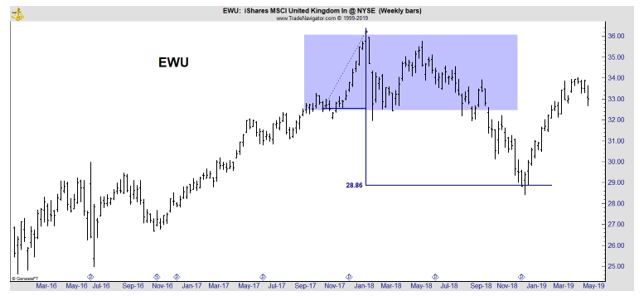
An advantage of trading the ETF is that it provides diversification for investors who may not be familiar with the best companies to trade in the United Kingdom. The ETF is also priced in dollars which eliminates direct costs of currency exchanges since they are included in the fund’s expenses.

EWU initially moved up on the news of Brexit after bottoming shortly before the vote. However, at the beginning of 2018 it became apparent to some investors that the process was not going as smoothly as many had hoped. The deadline was approaching, and no plan was in place.

Traders could buy EWU if they believe the news associated with the rapidly approaching deadline will be bullish. Less optimistic traders could consider using put options on EWU to take a position to benefit from a down move in EWU.

As the deadline nears, volatility could increase and that means options premiums could potentially increase. Aggressive traders could consider selling options to benefit from that possibility and when selling options, spread strategies could always be used to limit risks.

Brexit creates a great deal of uncertainty and that is also creating potential trading opportunities. Now could be an ideal time to enter trades based on the expectations of the trader and options strategies could be especially appealing given their ability to limit risks.

Stock Picks

Another Sign of a Top

Market analysts often say that they don’t ring a bell at the top indicating that there is never a loud and clear warning that the stock market has reached a top and is likely to fall. Instead, they need to look for more subtle signals.

Among the signals analyst search for is a proverbial “rush to the exits” by smart money which often includes the venture capital finds that fund Silicon Valley startup companies.

That makes recent news that one of the largest VC funds is looking for a way to cash out as The Wall Street Journal reported,

“SoftBank Group Corp. is considering audacious fundraising plans, including a public offering of its $100 billion investment fund and the launch of a second fund of at least that size, as it looks to seize on an exploding startup scene, people familiar with the matter said.

More immediately, SoftBank is negotiating with the sultanate of Oman for an investment of several billion dollars in its existing $100 billion Vision Fund, which raised nearly all its cash from Saudi Arabia and Abu Dhabi, the people said.

The fund’s staff is hustling to keep up with the frantic pace of deal making by SoftBank founder and Chief Executive Masayoshi Son, who has invested nearly all the money that the Vision Fund took in just two years ago.

Highlighting the need for new funds: Mr. Son recently returned from China, where he negotiated informal deals worth several billion dollars that the Vision Fund doesn’t yet have, one of the people said.

buying spree chart

Source: The Wall Street Journal

The Vision Fund had planned to invest its money over four years, some of the people said, but will have done so in just over two.

Coming IPOs of companies it is invested in—including Uber Technologies Inc. and WeWork Cos.—will free up some money, but not enough to fund everything Mr. Son wants to buy.

The fund plans to double its staff to 800 people from 400 over the next 18 months, one of Mr. Son’s top deputies said this week at a conference in Los Angeles, compounding the pressure to raise more money so they can be paid to hunt for deals across the globe.

A Vision Fund IPO is the most ambitious of the plans under consideration and would take place after the fund is fully invested, likely by this fall, according to people familiar with the matter.

The hope is to create a smaller version of Warren Buffett’s Berkshire Hathaway Inc. —only loaded with young technology companies, many of which have yet to turn a profit, instead of a stable of well-established utilities, insurers and energy companies.

An offering like this is largely unprecedented. If successful, it would tap into a new pool of money—mom-and-pop investors—who typically can’t invest in venture-capital funds due to regulations meant to protect unsophisticated investors from risky assets.

SoftBank executives are working to overcome those regulations, some of the people said, and it might not happen. Another barrier is that some of the fund’s hottest investments are set to go public themselves this year, which would reduce the allure of its offerings.”

Doubts About the Deal

There could be some problems with getting the offering approved as Bloomberg’s Matt Levine notes, “I mean it doesn’t sound especially legal, at least under U.S. law.

Berkshire Hathaway, for all that we think of it as a Warren Buffett stock-picking vehicle, is actually an insurance company with a bunch of other wholly-owned operating businesses.

A fund consisting entirely of minority stakes in other companies—that is, a venture fund—would seem to count as an “investment company” under U.S. law, and U.S. rules do tend to discourage widely marketed investment companies that buy mainly illiquid private stakes.”

This could prevent Softbank from completing this deal.

Getting In Ahead of the Offering

While there could be concerns about a separately traded investment fund, there is a way to invest in SoftBank which manages the fund through an ADR in the US markets which trades as (Nasdaq: SFTBY.)

Softbank chart

Source: Yahoo

SoftBank is not the Vision Fund although they share management.

SoftBank is described as “a Japanese multinational holding conglomerate headquartered in Tokyo, Japan. The company owns stakes in a number of companies including:

  • Softbank Corp.
  • Softbank Vision Fund
  • Arm Holdings
  • Fortress Investment Group
  • Sprint (85%)
  • Alibaba (29.5%)
  • Yahoo Japan (48.17%)
  • Uber (15%)
  • Didi Chuxing (ca.20%)
  • Slack Technologies (ca.5%)
  • WeWork (ca.22%)

There are some reasons to consider buying SoftBank now as the Financial Times recently reported, “

“Mr Son as an opportunistic and even whimsical investor was given fresh ammunition last week with the revelations that he had lost $130m of his personal fortune on a bitcoin investment and poured €900m of SoftBank funds into Wirecard, the German payments group fighting an accounting scandal.

… Armed with cash from the $23.5bn listing of SoftBank’s mobile unit and Japan’s largest-ever corporate bond sale to retail investors, and with Uber’s blockbuster IPO around the corner, Mr Son is finally starting to dispel the notion that his Japanese technology conglomerate is risk-addicted and debt-laden. 

So flush is Mr Son feeling that he launched a $5.5bn share buyback in February.

“Until now, SoftBank was viewed as a group loaded with debt and doing dangerous things,” Mr Son said in February. “In time, all that noise will go away.”

Mr Son has consistently complained that investors do not appreciate the group’s true worth. In February, when its market capitalization was ¥9tn ($80bn), he argued that SoftBank shares were undervalued by nearly 60 per cent.

His calculations put the company’s net debt at ¥3.6tn and its trove of equity holdings including Alibaba, WeWork and Uber at ¥25tn, implying ¥21tn of value for shareholders. 

Now, more investors are beginning to buy into his view.

Since the public offering on December 19 of stock in its mobile subsidiary, SoftBank Group shares have risen 41 per cent to a 19-year high.

The cost of five-year credit-default swaps to insure against non-payment of debt by SoftBank has dropped by nearly 100 basis points since the start of the year to 170 bps, according to data from Bloomberg, having risen sharply after the murder of journalist Jamal Khashoggi prompted concern about the group’s ties to Saudi Arabia.

Richard Kaye, a portfolio manager at French asset manager Comgest, a SoftBank shareholder with a $50m stake, said that events, including the flotation of SoftBank’s mobile unit and the filing for an IPO by Uber, where SoftBank is the largest shareholder, have given investors confidence in the Japanese group’s ability to monetise its assets. 

“This could be the beginning of a rather long reassessment by investors of SoftBank’s potential,” Mr Kaye said.”

Whether the Vision Fund IPO succeeds or not, SoftBank could be worth a look.