Spot Dangers and Find the Best Return on Investment
While reviewing potential investment opportunities, many investors consider the yield. The yield for a stock is exchange traded fund (or ETF) is the amount of income distributed to investors.
For stocks, the distribution is usually a dividend. For an ETF, which is an investment portfolio that holds other individual investments, he distribution could be in the form of dividends, capital gains or, in some cases, a return on investment. Each has a different tax treatment and that is important to consider.
Tax treatment can be important to consider because it can be more expensive to file returns that involve more than dividends or capital gains. These factors point to the need to do research when considering buying an ETF that invests in anything other than a plain vanilla stock market index.
But, even before considering the tax implications, investors should consider the sustainability of the yield. In a scan of ETFs, sorting by yield from highest to lowest, the top five are shown below. The highest yielding ETF reports an annual yield of 86%.
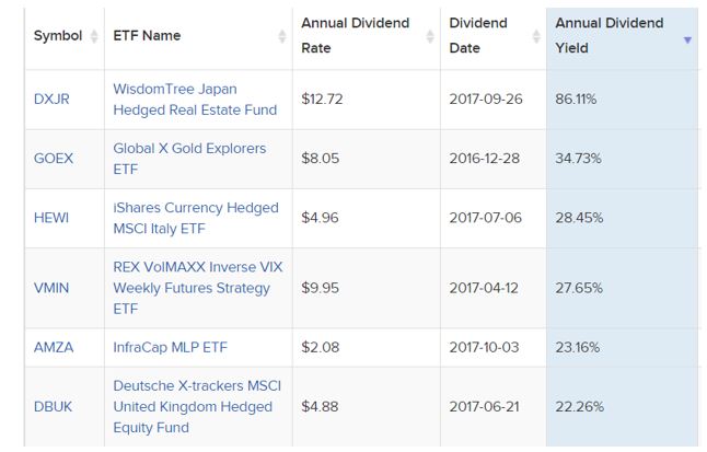
Source: EFTDB.com
High yields like this present a problem. First is the tax problem. Investors are taxed on the distributions. Assume an ETF pays a similar amount this year and you buy at the current price. For this example, consider buying 100 shares for $1,272.
The payout of about $10.93 would reduce the value of the ETF by $10.93 and create taxable income of $1,093 for some investors who hold the ETF in a taxable account. Assuming a 20% state and federal tax rate, the investor loses $218.60 to taxes. The real amount could be more.
After taxes, the investor owns 100 shares valued at $179 and has a cash balance of $874.40. The investment immediately lost 20%, or whatever the individual investor’s actual tax rate is.
High Yields Are a Warning
The highest yielding ETFs in this example may or may not make a large distribution this year. But, the fact that they did create large tax liabilities for investors in the past is a red flag that should not be ignored.
High yields like this seen above are usually related to unique events. For example, the gold explorers fund might have switched the index tracked which required making a large number of trades and passing on capital gains to individual investors.
When considering where to find the best return on investment, taxes must be considered because the best returns are actually those that deliver large gains that investors can keep.
For stocks, a high dividend yield is also a warning sign. This was a lesson many investors learned in the financial crisis of 2008 and 2009. The chart of Bank of America (NYSE: BAC) shown below provides an example.
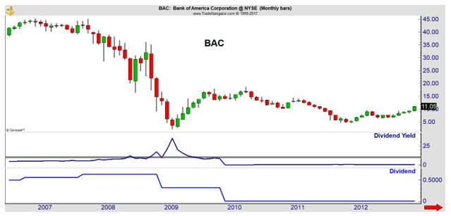
The dividend yield is shown in the center of the chart. The vertical grey line shows the yield moved above 10% as the price of the stock fell in 2008. Shortly after that, the amount of the dividend, shown as the blue line at the bottom of the chart, was reduced.
High yields, whether in ETFs or stocks, are a sign of risks to smart investors.
To Find High Returns, Stick With What Works
While investors will often seek out high investment returns and accept significant risks, history already tells us what works in the long run. Simply put, owning stocks is the best way to generate high rates of returns on investments.
The chart below is from the Credit Suisse Global Investment Returns Yearbook and shows that stocks deliver the largest gains in the long run.
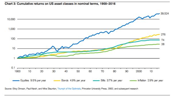
Source: Credit Suisse
The chart above shows the returns on US assets. Credit Suisse reported on 21 countries which had a continuous record of returns dating back 117 years. To make returns comparable across countries, they adjusted for inflation.
After inflation, US stocks delivered an average annual gain of 6.4%. Just one country did better than that. Australian stocks averaged an annual gain of 6.8%. The worst performer was Austria with an average annual gain of 0.8%.
Bonds provided an after inflation return of 2% or less and short term government bills maturing in less than one year consistently averaged a return of less than 1% across the international database.
Over short time frames, returns can vary considerably but stocks are consistently the best performers with bonds lagging in wealth creation around the world.
It is interesting to note that over the full 117 years, fixed income investments averaged negative returns in Austria, Belgium, Finland, France, Germany, Italy, Japan and Portugal. In 38% of the countries, fixed income investors suffered a real loss of buying power in the long run.
Which Stocks Did Best?
Now, focusing solely on the US, there are several ways to divide stocks. We can consider stocks by size, value and momentum.
First, let’s consider size.
The chart below shows that smaller is better for stocks. The gains from micro cap stocks is significantly better than the gains of large caps. Over time, this difference compounds dramatically and micro caps deliver 11 times the gains of large stocks.
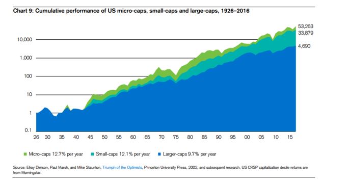
Source: Credit Suisse
Next is the question of value.
The next chart summarizes the results of a study that split stocks into two groups. The first group is stocks that are undervalued and the second group is stocks that are overvalued. Undervalued stocks, as a group, performed 18 times better than overvalued stocks.
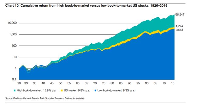
Source: Credit Suisse
To determine value, the study summarized in the chart above used the book to market ratio. This is the inverse of the more commonly known price to book (P/B) ratio. Academic studies use the former ratio while investors tend to use the latter.
Investors generally look for a low P/B ratio to find value. In studies, a high book to market ratio (which is the inverse of the P/B) ratio shows value. Results are the same for either ratio.
Finally, we can look at how momentum affects returns.
This research is summarized in the chart below and it shows stocks with high momentum outperform stocks with low momentum.
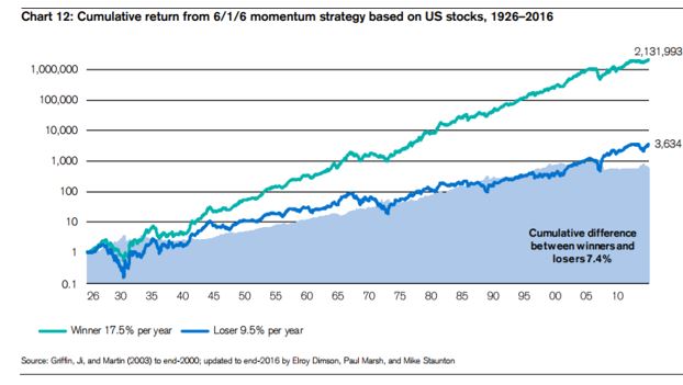
Source: Credit Suisse
To find momentum, this study calculated the stock’s return over the past six months, ignoring the most recent month. They then sorted from high to low. The highest value of momentum were considered to be winners in the chart above and low values of momentum were considered to be losers.
The calculations were repeated every six months. The results above show that winners delivered gains that were about 585 times better than losers.
Putting It All Together to Maximize Your Investment
When searching for the best investment returns, history tells us that investors should focus on stocks that are small, offer value and are going up. These stocks benefit from the market beating factors shown above.
There are actually a number of ways to do this. Investors can screen for all of these factors and buy stocks that meet all three criteria. Or, investors can focus on just one of the criteria and their portfolio is still likely to outperform the broad market.
One possible screen would be to look at stocks in the smallest 20% of the market when ranked by market cap. Then sort this list for value, looking at only the stocks which have a P/B ratio in the bottom 20% of the group of smallest stocks.
Finally, this screen would rank the short list of stocks that passed both size and value tests by momentum. Buying only the best performers from that short list should consistently deliver market beating results in the long run.
To learn more about how you can gain financial independence, click here, as we have new products coming your way soon!